"A small team of A+ players can run circles around a giant team of B and C players." - Steve Jobs

Stratosphere Digital is a small, elite team of digital experts, helping companies large and small tackle design and technical challenges quickly and effectively.

Our Clients

We helped develop the onboard fuel system module for the XB-1 supersonic jet and implemented real-time LSO (Landing Safety Officer) and PLAT camera (Pilot Landing Aid Television) views for flight simulation testing.

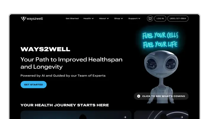
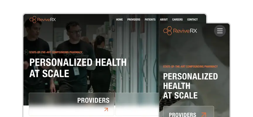
We redesigned and rebuilt the website of a health company that provides preventative care and cutting-edge wellness treatments.

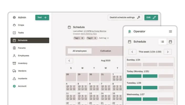
We created an intelligent, ultra-efficient warehouse-management software tool for a cannabis grow house.

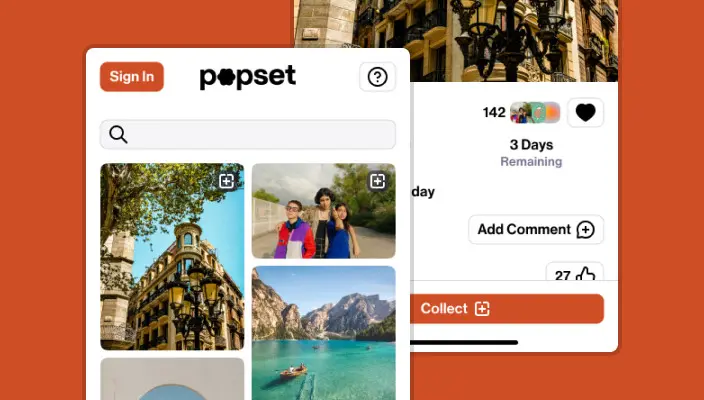
We designed and developed an iOS and Android app for the next generation of Web3 social media.

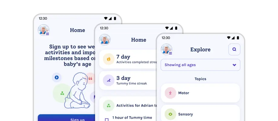
We built an early childhood development app for a nonprofit foundation that provides free, trusted resources to parents and health professionals.

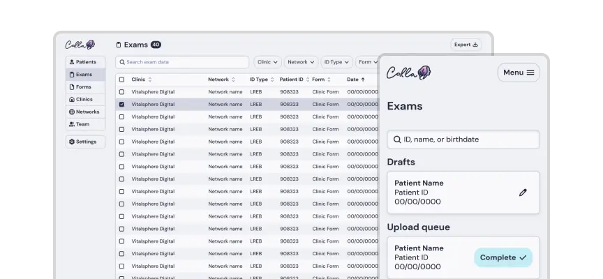
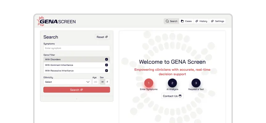
We built a web app for a medical imaging software company that provides nuclear cardiologists with digital tools for assessing patient health.

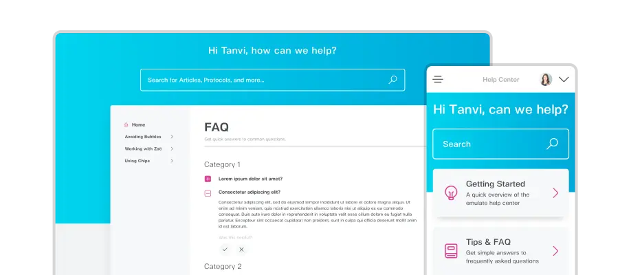
We helped build and maintain custom back-end systems and a responsive website and web app for Emulate, a Boston-based company that specializes in Organs-on-Chips technology.

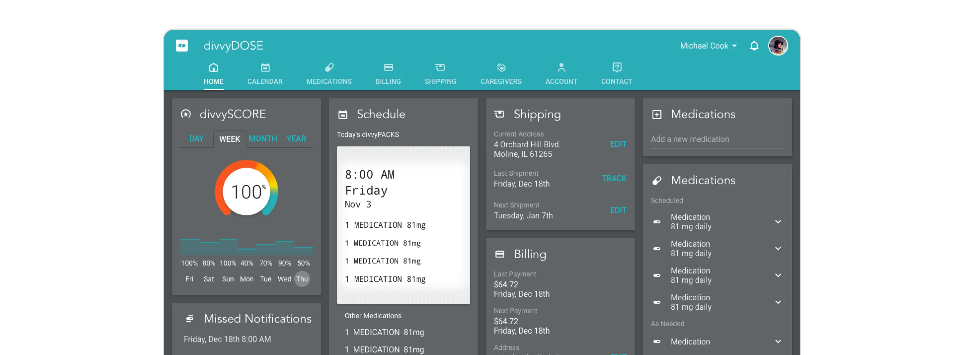
We built a website, a cross-platform app, and custom internal systems for a full-service online pharmacy.

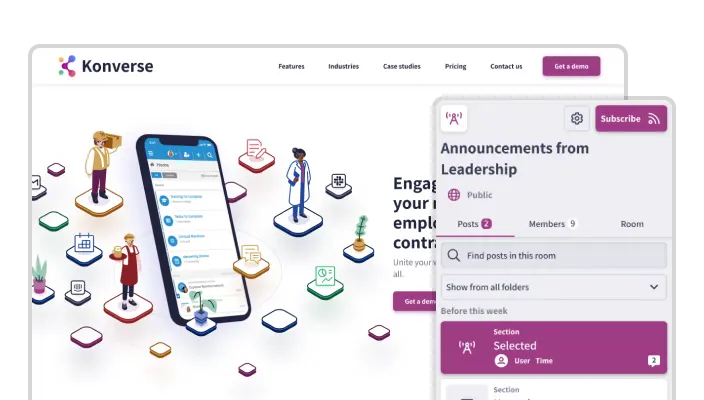
We designed and developed a new website for a business communication platform. We also redesigned their web and mobile apps and produced a pitch deck and a promotional video.

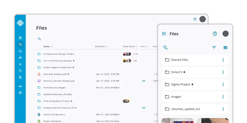
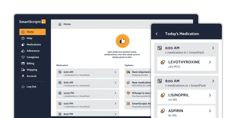
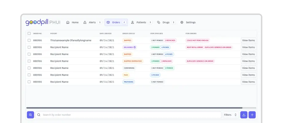
We designed and developed a suite of web applications for a non-profit home-delivery pharmacy.

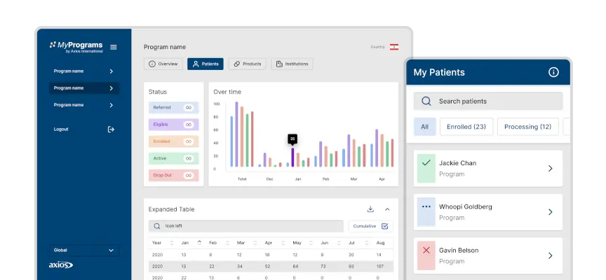
We redesigned an international healthcare access company's digital tool suite for physicians, pharmacists, patients, and large healthcare organizations.

We developed custom internal data and reporting systems for a worldwide fitness brand comprising 70+ studios around the globe.

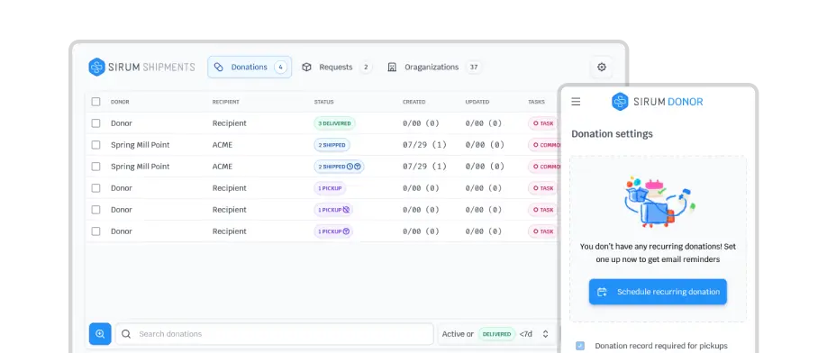
We designed and developed a suite of web applications for a medicine-donation platform.

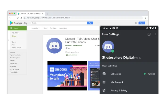
We updated Discord's Android icons for Material Design.

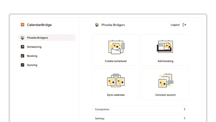
We redesigned a web app for smart scheduling and calendar management in business and enterprise.

Opyn

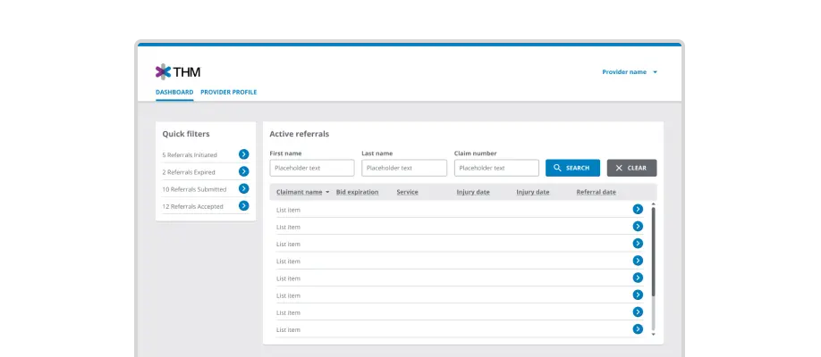
We designed a new way for healthcare providers to manage workers compensation bids more honestly and transparently.

Vasa Logo

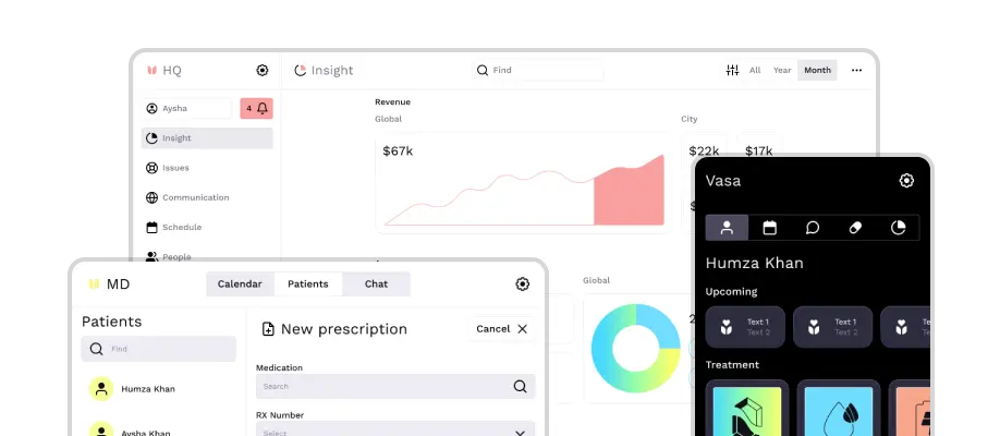
We designed and developed a suite of brands, a website, and mobile apps for a healthcare startup aiming to redefine healthcare with mobile technology at the core of the user experience.

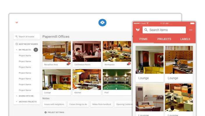
We built an iOS app and redesigned a web app for an online presentation and collaboration tool.

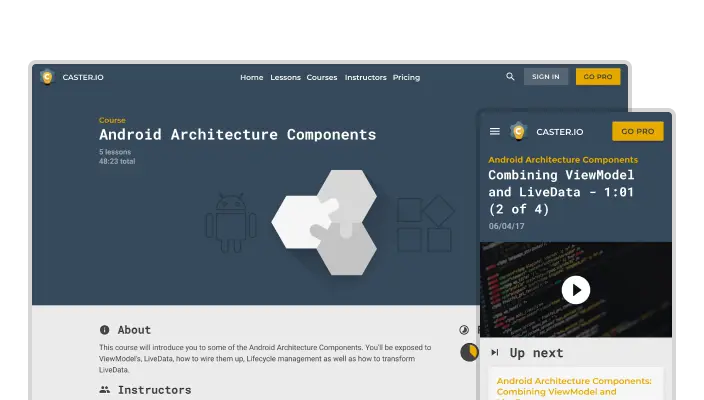
We rebuilt a website and web app that provides video-based training for Android developers.

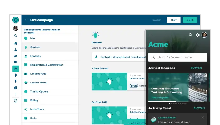
We redesigned a custom web and mobile app for the #1 microlearning platform for trainers and companies.

We built a website, a web app, and custom internal systems for a food delivery startup.

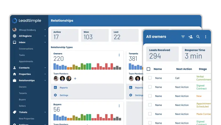
We helped redesign a web app built for property managers to simplify sales, streamline operations, and scale their businesses.

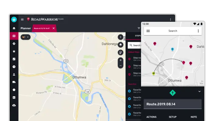
We redesigned a fleet management web app and route-planning mobile app for a service that optimizes delivery routes.

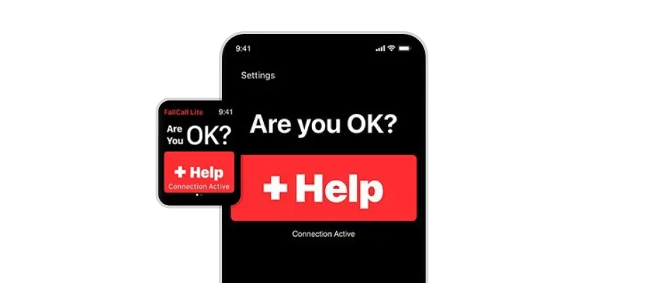
We developed new features and performed maintenance for the first ever medical alert Apple Watch app.

We helped build custom web and mobile apps for an online fitness startup.

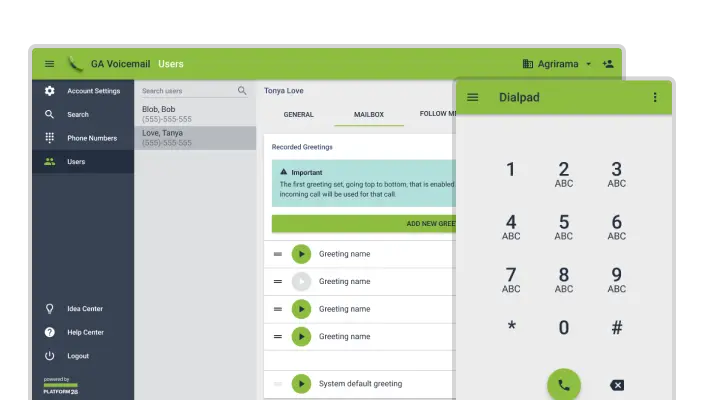
We redesigned an enterprise voicemail system and a compact VoIP virtual business phone.

We redesigned a suite of product icons for a leading provider of mobile privacy, security, and performance apps.

ShopTwigs

We built a responsive fashion boutique eCommerce website.

Web Video Caster

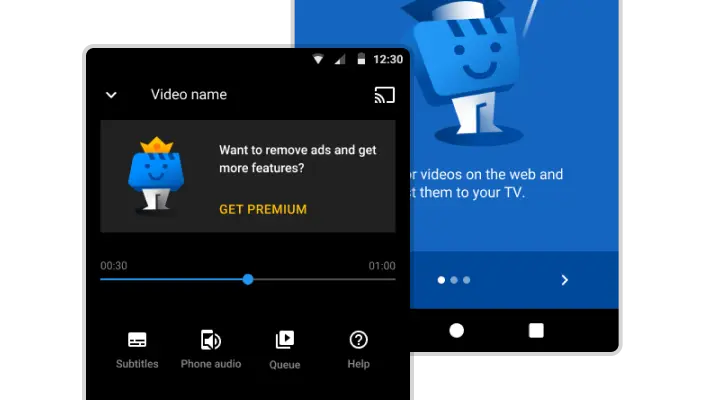
We redesigned an app that streams web videos to your TV.

Ping

We designed an iOS app for the world's smallest GPS locator.

Agora

We built a browser extension to improve online shopping.

Cookicons

We design the best Material Design app icons.

Papermill Collective

We designed a website for Material Design freelancers.

Our Services

Our services include, but are not limited to:

General Development

  • PHP
  • Node.js
  • Meteor
  • Python
  • Ruby
  • JavaScript (ES6/7, CoffeeScript, TypeScript)
  • Angular
  • React
  • Vue.js
  • HTML5
  • CSS (Stylus, Sass)
  • AJAX, WebSockets
  • MongoDB
  • MySQL
  • Cordova
  • AWS
  • C#
  • C/C++
  • Java
  • Objective-C
  • Swift
  • QS/1, HL7, HIPAA
  • React Native
  • iOS
  • Android
  • eCommerce
  • Architecture design
  • Technical documentation
  • Performance and optimization
  • Code reviews
  • Product analytics

Blockchain Development

  • Web3
  • NFTs
  • dApps
  • DeFi
  • Smart Contracts
  • DFINITY/Internet Computer Protocol
  • Motoko
  • Solidity
  • Governance/DAOs
  • Chainlink Adapters/Oracles
  • EOSIO/WAX
  • IPFS

Design

  • Web
  • Mobile
  • UI/UX
  • Iconography
  • Illustrations
  • Prototyping

Want to see what a final design deliverable looks like?

Project Management

  • Specification documents
  • Feature definition
  • Project guidance
  • Idea review
  • Budgets and timelines
  • Team coordination
  • User testing
  • Technical training

Testimonials

What our clients have to say

We’re lucky to have their team of incredible talent.

If you want your software to be visually appealing, functional, and ultimately successful, Stratosphere is a great choice.

Stratosphere is far from your average tech team and SignUp Captions would not be what it is without them!

I simply cannot imagine finding anyone else—even a dedicated internal team—as committed to understanding our business needs...

Working with Stratosphere Digital on our website and app UI/UX redesign has been a great experience.

We feel lucky to have found their team of talented designers and developers.

Working with Stratosphere Digital has been downright incredible.

...the Stratosphere Digital team has demonstrated strong teamwork and the technical capabilities necessary to help us accomplish our goals.

I would recommend Stratosphere to any company...

Stratosphere's work is precise, elegant, and always well thought through.

Working with the Stratosphere team was an absolute pleasure.

The team was always available, friendly and knowledgeable...

We consider discovering Stratosphere one of the best breaks we've had thus far...

Stratosphere successfully executed on tasks that other developers didn't even think were possible.

Their developers were sharp and experienced, seamlessly working with our team to quickly implement effective solutions.

They are great listeners, great designers, and great developers, and are genuinely passionate about what they do.

...they were the elite group I’d been looking for.

It is clear they treat every project as though it were their own business...

I really appreciate their ability to quickly translate a verbal idea into a tangible product.

Stratosphere has repeatedly demonstrated an unparalleled level of creativity and innovation...

Their collaborative and innovative approach made the entire process seamless and efficient.

I highly recommend Stratosphere's team...

We really appreciate their creativity, intelligence, and how quickly they were able to understand our industry.

Stratosphere’s team came to the initial brief with exceptional concepts and consistently followed through on our vision.

Their work screams thoughtfulness and attention to detail.

Stratosphere has been an invaluable partner in our app development journey.

From the very first meeting, Stratosphere took the time to understand my vision and worked towards making it a reality.

We are incredibly grateful to the entire Stratosphere team and could not recommend them more highly.

The Team

  • Eliyah Finkelstein

    Chief Executive Officer

  • Wesley Folz

    Chief Technology Officer

  • Michael Cook

    Chief Design Officer

Who are you?

Hi, I'm Eliyah (pronounced El-ee-yuh).
What would you like to know about me?

Who are you?

Hi, I'm Jonathan.
What would you like to know about me?

Who are you?

Hi, I'm Michael.
What would you like to know about me?

Who are you?

Yo! I'm Tom ✌️ Ask away!

Who are you?

Hi, I'm Luca. Here's some information about me!

Who are you?

Hi, I'm Wesley. What questions do you have?

Who are you?

Hi, I'm Malinda! I love answering questions about myself. 😉

Who are you?

Hi, I'm Rob

Who are you?

Hi there! I’m Andrew.

Who are you?

Hello, I’m Antoine. What would you like to know about me?

Who are you?

Hi! My name is Jessie.

  • Tom Wellington

    Senior Designer

  • Malinda Gosvig

    Project Manager

  • Jessie Orne

    Project Manager

  • Jonathan Cook

    Senior Developer

  • Luca DeCaprio

    Senior Developer

  • Rob Stanica

    Senior Developer

  • Andrew Currier

    Senior Developer

  • Antoine Robidoux

    Senior Developer

Our Blog

Top 5 Common Mistakes to Avoid in Software Development

6 Questions You Should Ask Before Working with a Software Development Agency

The Benefits of Continuous Integration and Delivery in Software Development

Our Philosophy on Building Trust and Managing Client Expectations

Comparing JavaScript Libraries: Vue.js, Angular, and React

Frontend, Backend, Fullstack: What Do These Mean?

Avoiding Hidden Costs in Software Development

How to Maintain HIPAA Compliance in Software Development for Web and Mobile Apps

Invisible Software Development Costs Caused by Technical Debt

How We Think About the Project Manager Role

Why You Should Start with a Minimum Viable Product (MVP)

Why We Engage Almost Exclusively on Retainers

How Much is My Software Project Going to Cost?

Why You Should Write a Specifications Document Before Starting Any Software Development Project

The Importance of a Single Source of Truth for Software Development Projects

What We Look for in a Client

How a Properly Executed Design Phase Saves Tons of Development Time

Contact Us

contact@stratosphere.digital
816-866-1124

Get In Touch

Cool Beans.
The message was sent. We'll get back to you shortly.

Fiddlesticks.
The message failed to send.

Hire Us

Does your project require design, coding, or both? Is your project a website, a mobile app, or both?

Is there a reason the project needs to be finished by a certain date? How flexible is the due date?

Is your budget fixed? Does it have a range? Or maybe you're just not sure yet.

How does your business quantify success? Can you describe your target audience? Who are your main competitors?

Cool Beans.
The message was sent. We'll get back to you shortly.

Fiddlesticks.
The message failed to send.

Schedule

If you’d like to speak with us directly, you can schedule a 30 minute meeting.

Pick a date and time

2020

Meeting Scheduled.

Fiddlesticks.
The meeting could not be scheduled.

Stratosphere

We tackle design and technical challenges quickly and effectively, giving your business the boost it needs.

If you just want a basic website, there are plenty of people who can help. However, if your ambitions require a custom-tailored approach—or if you need a little extra guidance in figuring out your ideal end result—Stratosphere Digital is the agency for you.

The Founding Team

Are you an agency?

Don't risk losing your client's business because of capacity overload or unconventional requests.

Has an important client come to you with a task outside of your team's expertise? No need to expand your team just to fulfill the occasional request—we're here to make sure you can always say "yes" to your clients without stretching yourselves too thin. And you can count on us to blow them away with the result, leaving you looking like the heroes they expect you to be.

Contact Us Return To Main

Boom

The Client

Boom Supersonic is transforming air travel with the world’s fastest airliners, optimized for speed, safety, and sustainability. Boom Supersonic’s aircraft fly at twice the speed of today’s airliners and are designed to run on 100% sustainable aviation fuel.

"Working with Stratosphere’s flight software engineers was a refreshingly positive experience. They were able to absorb technical material with little guidance and independently arrive at well-thought-out solutions. Stratosphere provided debugging, troubleshooting, and analysis of our XB-1 Experimental Aircraft flight software as well as made significant contributions to the onboard fuel system module. They also expanded our X-Plane flight simulation capabilities enabling test pilots to prepare for the first flight of the Boom Supersonic Jet. We’re lucky to have their team of incredible talent."

- Jeff Bozarth, Lead Avionics Engineer

The Solution

Boom needed support to finish their flight software system before moving forward with testing their first experimental supersonic jet, XB-1. We made significant contributions to the onboard XB-1 fuel system calculations responsible for accurately informing the pilots of their remaining fuel levels and implemented an extensive rework of the associated fuel system unit testing. We also worked closely with Boom’s avionics engineers to expand the capabilities of their custom X-Plane flight software simulation. We implemented simulated real-time LSO (Landing Safety Officer) and PLAT camera (Pilot Landing Aid Television) views of the flight model as well as accurately diagnosing and correcting simulation 3D model errors that were leading to a false feel of the sim for the test pilots.

Boom Supersonic Prototype Jet

The Services

The Stack

Supported Platforms

XB-1 Flight Software Support

General support for the flight software team included interpreting aircraft data from engine and taxi testing, troubleshooting electro-mechanical device communication, debugging the extensive Jenkins CI-CD system, and facilitating feature requests from the many multi-discipline engineering teams responsible for XB-1.

XB-1 Flight Controls

XB-1 Fuel System Display

Working with Boom’s system engineers, we added a multi-tiered warning system to the existing fuel software calculations displayed on the onboard aircraft multifunction display (MFD). We coded fuel system interactions between hardware and Simulink computational models, including temperature readings, totalizer checks, center of gravity analysis, and fuel flow.

XB-1 Fuel System Display

The XB-1 Simulation

We continually supported the primary test bed of the flight system, an X-Plane-based working replica of the XB-1 cockpit and damper actuators. Boom’s existing simulation model had significant errors that were difficult to pinpoint but led to an inauthentic flight experience for the experimental test pilots. For example, the 3d dimensional model of the plane used for the first person camera offsets never touched the ground, instead hovering ten feet above it when in a landed state. We worked with the mechanical modeling team to build an accurate representation of the XB-1 and seamlessly integrated it with the custom Boom physics engine layered on top of X-Plane simulation software in order to accurately represent flight and landing behavior.

XB-1 Flight Controls

LSO and Landing Camera Simulations

As part of the XB-1 Validation, Boom required both landing signal officer (LSO) and pilot landing aid television (PLAT) camera views. We helped build out the ability to have multiple simulations simultaneously running off of the same flight model, and then developed both LSO and PLAT views so that the ground control team could rehearse landing procedures in real-time.

XB-1 Flight Controls

Ways2Well

The Client

Ways2Well is a digital health company that provides preventative care medical services. They focus on advanced blood chemistry analysis and regenerative treatment solutions for patients throughout Texas.

"Stratosphere has repeatedly demonstrated an unparalleled level of creativity and innovation, consistently exceeding my expectations at every turn. From the moment I engaged their services, their attention to detail and dedication to excellence was evident in every aspect of their work. They are truly a group of elite experts dedicated to delivering high-quality software.

They are also always incredibly responsive to my needs and consistently go above and beyond to ensure that I am satisfied with the final result. They listen carefully and act autonomously, ultimately giving me peace of mind that my ideas will be turned into reality.

Overall, I cannot recommend Stratosphere highly enough. Their exceptional talent, professionalism, and commitment to excellence make them a true standout in their field."

- Brigham Buhler, CEO / Founder

The Solution

Ways2Well’s founder had been invited to go on Joe Rogan’s podcast, but the company’s site was hosted on Shopify, looked dated, and was not equipped to handle the influx of anticipated visitors. Additionally, Ways2Well wanted new site sections, including a browsable mail-order pharmacy. We re-designed and rebuilt their site to give it a more forward-looking feel, set it up to handle the anticipated traffic, and built out the additional sections in time for their launch. 

Following the launch, we added custom patient scheduling and questionnaire integrations with CharmHealth, built out custom ecommerce solutions, and restructured their multiple user signup processes to be cleaner and more intuitive. We also redesigned their product labels and packaging.

Ways2Well Website Screenshots

The Services

The Stack

Supported Platforms

Custom API Integrations

At the time we began working with Ways2Well, they were manually scheduling patient visits and manually copying and pasting information from forms submitted via their website. To lighten the load of their internal team, we built custom API integrations with CharmHealth, their EHR, to service patients with site calendars for scheduling and site questionnaires that automatically submitted answers to their EHR. When Ways2Well’s clinicians requested patient-specific limits on scheduling, we developed a scheduling allowance system that they could update as needed.

Additionally, we integrated all forms on the website with Hubspot, a CRM that allows Ways2Well to track and communicate with their contacts, including sending automated emails and text messages.

Brand Development

Ways2Well’s original site did not communicate their cutting-edge wellness brand. We spent a few weeks exploring UI concepts, color, style, spacing, and fonts, and ultimately settled on a instagram-style grid layout with large photography and minimal text. Additionally, we updated their logo and produced a style guide for them to use in social media marketing.

Ways2Well Website Screenshots

Landing Page

We streamlined the core landing pages to highlight Ways2Well’s treatments.

Ways2Well Website Screenshots

eCommerce

Ways2Well needed a variety of unique checkout workflows since some of their services require clinic scheduling, others require mandatory health forms, and others require shipping. We devised a solution that allows Ways2Well to host and edit the appearance, price, and description of their products and services on Square, while providing users with custom-tailored shop pages, cart, and checkout processes.

Ways2Well Website Screenshots

Sign Up Process

We took Ways2Well’s multi-page PDF patient intake form and translated it into a user-friendly online questionnaire.

Ways2Well Website Screenshots

Package Design

We designed new labels and packaging for Ways2Well’s products, including:
Supplements, Health Tests, IVs, Comprehensive Blood Work Testing

Ways2Well Website Screenshots

Animation

We wanted to give Ways2Well some life through animation so we provided an intro video and footer video.

Header

Footer

Design System

We built Ways2Well a custom set of styling and components to use across their site and apps.

Ways2Well Website Screenshots

Vangarden

The Client

Vangarden is a wholesale producer of a full range of cannabis products, from flower to extracts to edibles.

"I simply cannot imagine finding anyone else—even a dedicated internal team—as committed to understanding our business needs and partnering in crucial design and development decisions. If the stakes are high and you're looking for a team with critical thinking, collaborative and creative problem solving, deep technical ability, on-the-fly reprioritization, and straight-shooting communication, look no further."

- Corey Morrow, Chief Process Officer

Solution

We created an intelligent warehouse-management software tool for a cannabis grow house—the most complex project we’ve taken on to date.

This visionary tool massively improves efficiency by automating task management and training, creating a level playing field for employees and empowering them to take control of their own career progression. For managers, it cuts down on countless wasted hours, saving money and administrative headaches, so they can focus on the ultimate goal of harvesting a crop and turning it into a successful product.

With our work for Vangarden, we’ve transformed the grow house experience.

Good Pill Solution Screenshot

The Services

Supported Platforms

Facility Map

We designed a bird’s-eye-view map of the grow house that indicates in real time where everyone and everything is located within the facility. Vangarden has incorporated RFID technology into their grow house, tagging each person, plant, and piece of equipment and placing readers in each doorway and every 10 meters of the hallway. This allows for assurance that all products and supplies are accounted for and protected, and offers full transparency as to the whereabouts of each employee to keep things running smoothly.

Good Pill Solution Screenshot

Tasks

Based on Vangarden’s meticulously scheduled sequence of crop cloning, cultivation, and harvest, we created a customizable task-management interface that allows managers to define tasks that the system will then automatically assign.

Administrators initially enter tasks manually, specifying what type of task needs to be done in what room, on what day of the harvest cycle. They define the roles within each task, how many operators each task requires, and what materials are needed to complete each task. They can also designate prerequisite tasks and set priorities. Administrators then list directions for each task, telling operators what to do step by step, with instructional text, images, and videos as needed.

From the operator standpoint, based on their location, each employee will be assigned a task by the software. It tells them how long the task should take, where in the facility it needs to be performed, how many people it will require, what materials are needed, and whether there are breaks involved in the task. Once the operator completes that task by following the step-by-step instructions, they’ll be assigned a new task.

Good Pill Solution Screenshot

Scheduling

We implemented a scheduling app with settings that go deep, allowing administrators and employees alike to view broad timelines as well as drill down to manage specific shifts.

Managers have a host of tools at their fingertips to make sure all the necessary shifts are covered. They can see who is scheduled for each of the three shifts on a particular day, versus how many people should be scheduled based on the tasks that need to be accomplished to keep the crop cycles on schedule. Beyond overseeing detailed daily staff requirements, administrators can edit week-over-week schedules, specify certifications needed for certain shifts, add or remove people from shifts, view overtime employees, and see operators’ shift-change histories.

In a novel approach, our app puts operators in charge of their own schedules. Whether directly trading shifts with another employee, offering shifts to a pool, or picking up extra shifts from said pool, operators are in command of their availability. This puts the onus on them to find replacements when they’ll be out sick or on vacation. Because the harvest sequence is so precise, all shifts must be covered in order to stay on schedule. But since employees figure it all out themselves—and our interface helps them do so seamlessly—it takes the pressure off the management team so they can focus on the bigger picture.

Good Pill Solution Screenshot

Crop Management

We set up a management tool for each crop, which is made up of approximately 100 plants of the same type in the same location. Administrators can create new crops; define each crop’s start date, end date, and location; add notes; and specify strains.

The moment someone adds a crop into the system, a precise sequence of tasks is automatically created. Certain tasks run simultaneously, while others are prerequisites for others. These can include irrigating, pruning, cloning, propagating, monitoring, performing spot checks, transplanting, checking environmental parameters, and selecting the best plants to nominate to become new mothers.

Good Pill Solution Screenshot

Strain Management

Similar to our crop-management tool, our app features a tool for managing strains of crops, wherein administrators can create a profile for each strain. They can specify yield per plant, terpene profile, and variability; add notes; enter sales stats, including total sales volume and profitability; and denote products linked to that strain, such as gummies or vape cartridges.

Good Pill Solution Screenshot

Employee Management

We designed a clear, organized way to manage employee info—from basic contact details and password management to scheduling preferences, certifications, and room permissions.

Good Pill Solution Screenshot

Inventory Management

When operators perform tasks in the grow house, they often use products to complete those tasks. We devised a thorough inventory-management system to track task-based consumables like latex gloves and bleach, equipment such as hard hats and tape, and office supplies like coffee and hand sanitizer. Each product has a detailed page, listing pricing, amount left in stock, consumption over time, and vendor info.

Good Pill Solution Screenshot

Vendor Management

Within inventory management, we offer space for detailed info on Vangarden’s list of vendors. Similar to a CRM, this tool allows administrators to link inventory items to vendors, add vendor notes, and manage purchase orders and vendor invoices.

Good Pill Solution Screenshot

Product Management

We created an efficient management system for Vangarden’s products, with robust filtering options for existing products and a simple way to add new ones. All of their products, including bulk flower, pre-rolls, cartridges, gummies, softgels, and chocolates, are listed here with notes, corresponding SKU numbers, and info on product type and tier, brand, strain, and weight per unit.

Good Pill Solution Screenshot

Forums

We designed user forums for streamlined communication within the company. Administrators can use this space to post announcements—as well as delete or moderate other posts—and users can post suggestions, either anonymously or under their names. Featuring an easy-to-use interface with search functionality, the forums allow everyone to stay in the know through posts, replies, and notifications.

Good Pill Solution Screenshot

Reports

We created a way for users to report issues at the facility, whether someone has been injured, there’s been a pest or mold sighting, a piece of equipment is malfunctioning, or an item is low on inventory. Incident reports are automatically tagged by location and can be submitted with photo or video attachments. Administrators then instantly receive the reports so that they can go about fixing the issue. Users can also report app bugs and request new app features here.

Good Pill Solution Screenshot

Admin Dashboard

For ultimate transparency, we designed an admin dashboard for administrators to see all their activity within the app, namely changes in tasks, schedules, inventory, and vendors. They can track what has changed, see who made those changes and when, and request features from our development team. In this way, the administrators of the company work together to refine their processes as they continuously strive towards a more optimal workflow and product output.

Good Pill Solution Screenshot

Packaging Design

We designed product labels and brand messaging for OnlyEdible, our client’s line of low-THC gummies. We crafted several iterations of label designs and copy for the line’s three products: OnlyActive, OnlyRelaxed, and OnlyRested.

Good Pill Solution Screenshot

Interface Component Library

Good Pill Solution Screenshot

Good Pill Solution Screenshot

Popset

The Client

Popset is a social app where artists, photographers, and creators alike can mint, share, and collect non-fungible tokens (NFTs) with other enthusiasts on a secure, on-chain platform.

"We had an idea for Popset but without a technical co-founder we lacked the skills necessary to get our project off the ground. Thankfully, we found Stratosphere, and it quickly became apparent to us that they were exactly the type of technical partner that we needed to bring our mobile app to life. Stratosphere served as a steady guide throughout the development process and ultimately delivered a better app to us than we could have initially conceived. We are incredibly grateful to the entire Stratosphere team and could not recommend them more highly."

- Alexander Hodes, Co-Founder

The Problem

Traditional Web2 social media creators are often dependent on advertising partnerships to achieve financial success. This model benefits well-established creators but can be challenging for emerging ones who may not yet have the necessary reach and advertiser connections. Additionally, relying on advertising partnerships raises concerns about the authenticity and ownership of the content shared on the platform, and can often alienate the creator's audience.

The Solution

Co-founders Alex and Sergio aim to transform the system of content sharing and monetization through an innovative, on-chain social platform. Bridging the gap between Web2 and Web3, Popset incorporates familiar features from traditional social media platforms, allowing users to easily join, create, and share content. What sets Popset apart from legacy platforms is its ability to mint posts on-chain, as well as collect and own other creator’s posts. Collection fees can be enabled on posts, allowing creators to earn directly from their audience each time they collect, without relying on sponsored posts to monetize their content. This approach not only helps decentralize monetization but also enhances the value of the content, leading to more empowered creators and a more engaged audience.

Popset screen1

The Services

Supported Platforms

Mobile App

popset screen2t

Minting

In order to pave the way for a new wave of Web3 users, Popset needed to be accessible to users unfamiliar with the technologies of Web3. Other minting apps require users to manage their own wallet and sign transactions. For the average Web2 user, these can be difficult obstacles to navigate.

In order to simplify wallet and minting processes, we utilize Crossmint: A 3rd party service that handles wallet creation, management, and minting on the backend. This allows users to sign up without needing an existing wallet and easily mint posts on-chain, so they can quickly get back to exploring the app.

popset Screen3

Monetization

Due to the current App Store regulations around in-app purchases and NFTs, we needed to devise a creative approach to monetize Popset and cover gas fees, all while keeping crypto transactions separate from the app.

We decided to go with the Solana blockchain platform, as it offers lower transaction fees, which allows Popset to provide free, daily minting to users. If users run out of free minting credits, they can purchase additional credits using in-app purchases. This goes toward covering the gas fees for minting a post, while Popset also earns a small fee from the credit purchases.

Creators seeking to monetize their content can opt to use the paid post feature. Collectors can buy these paid posts directly from creators through in-app purchases. Payments to creators are settled in fiat currency, while NFTs are automatically airdropped into the collector’s wallet on the backend without the need for the user to manage their own crypto wallet.

Unlike a monetization system reliant on advertising, this approach grants creators more freedom and control over their content, fostering a more supportive and meaningful connection between them and their audience. 

popset Screen4

Collect & Connect

Users can follow friends, like and comment on posts, collect someone else’s post, and build a curated collection of on-chain posts within their Popset profile. Collecting a post means having a piece of ownership over another user’s content, forming a permanent link between the two users. Whereas traditional social apps only offer likes, comments, and shares as forms of engagement, collecting is a new and much more meaningful way to show a creator a deeper level of support and connection.

popset Screen5

Earn XP & Rand on the Leaderboard

To encourage users to create, collect, and participate, we built a simple XP system so each time a user creates or collects a post, they automatically earn XP. Furthermore, they can view their rank among friends and other users within the Popset leaderboard.

popset Screen6

Creator Portal

We built a platform for verified creators to track engagement, earnings, and top collectors on Popset. The Creator Portal web app lets creators analyze earnings from individual posts and collectors, helping them optimize content and deepen audience connections.

popset Screen7
popset Screen8
popset Screen9

Interface Component Library

popset Interface

Pathways

Pathways Child Illustration

The Client

Pathways.org, a partner with the Shirely Ryan AbilityLab, is a nonprofit foundation that uses outcome-based research and tools to support each child’s fullest development. Since 1985 they have provided free, trusted resources to empower parents and health professionals in early detection and intervention for children’s sensory, motor, and communication skills. Their materials are developed by pediatric experts and supported by the American Academy of Pediatric findings.

"Working with Stratosphere has been one of the best decisions we've made. Instead of having to hire 3+ full time employees who may only specialize in specific areas, we've had access to their entire team of experts. This has allowed us to add features and designs that otherwise wouldn't have been possible. Their commitment to our work has also been exceptional. It is clear they treat every project as though it were their own business and want it to succeed. I wouldn't have any hesitation recommending them to any organization looking for app development."

— Nick Kerndt, Director / Associate Director of Digital Strategy

The Solution

Pathways came to us with a desire to bring their great storehouse of childhood development tools and resources into a more modern, interactive, and user-friendly format for busy parents: a mobile app.

Pathways App Screenshot

The Services

Supported Platforms

All the information

All the information you might need to raise a child – made more convenient than ever.

If you’ve ever searched for “baby development milestones” on the internet, chances are you’ve come across Pathways.org. Pathways has produced one of the largest NGO libraries of parenting resources over the course of the past 35 years. You can find their print materials translated in over 27 languages in doctors offices across the world, and they have maintained an online presence since the early days of the internet.

However, their online content wasn’t “smart.” Their resources were sorted by age group, but not interlinked in any comprehensive way, and their website didn’t allow users to keep track of milestones or abilities their child had already completed. This made it challenging for parents to discover tools and materials most relevant to their child. In order to get Pathways’ content structured in a way that would allow us to generate “smart” content suggestions, we needed to create a custom content management system. We built a prototype CMS for Pathways using Notion, and worked with their digital team to help them sort and categorize their existing library of resources.

With this new blueprint, we were able to build a mobile app that surfaces recommended content across categories based on what the parent or caregiver has already shown interest in and what stage of development their child is at.

Pathways Feature Icons

Our Design Approach

We tailor our design process to each of our clients in order to ensure that they get the results and resources they need to succeed.

We tailor our design process to each of our clients in order to ensure that they get the results and resources they need to succeed. For Pathways, our approach included the following:

Stratosphere Design Approach Icons

Style and brand exploration

Even though Pathways had a strong brand prior to working with us, they wanted to see our concepts for theming their new mobile app.

We spent a few weeks exploring UI concepts, color, style, spacing, and fonts and ultimately settled on an approach that blended a research-informed tone with a more fun one to resonate with their baby-rearing audience.

Design system

As an agency, we try to set each of our clients up for long-term success by building them a robust design system they can continue to use for years to come.

For Pathways.org, this meant building out a brand-new, mobile-centric set of components to elevate their users’ experience beyond what was possible on their WordPress site.

In order to get their MVP launched, we made a series of careful compromises that would allow us to launch the app quickly while still laying the groundwork for later features and providing enough value for their existing audience.

Pathways Solution Screenshot

Tummy Timer

Tummy time is one of the first and most important exercises for babies, as it develops their motor, visual, and sensory skills. Since pediatricians recommend one hour of tummy time a day, we built a custom tummy timer that allows Pathways app users to track, record, edit, and view their baby’s progress over time.

Pathways App Screenshots

Activities

Pathways already had a static library of activity videos for parents. Using the content management system we created for them, we built a database defining relationships among activity videos and other app content. When parents select an activity to try, they can see which milestones and abilities they are helping their baby work towards, as well as related articles or other videos they might enjoy.

Pathways App Screenshots

Milestones and Abilities

Pathways milestones and abilities are supported by the American Academy of Pediatrics findings. To help parents track their child’s development, we designed an interface for milestones and abilities that displays how much progress their child has made relative to what’s appropriate for their age group, broken down by category.

Pathways App Screenshots

Explore

For parents wanting to browse Pathways’ extensive library resources, we built out an “explore” section of the app that displays all content, linked by age-range and relevance, so that users can have the full breadth of information at their fingertips.

Pathways App Screenshots

Multiple Child Support

Since many parents and caregivers have multiple children, we designed the app to allow for easy switching between child profiles. Each child’s progress and saved content is maintained separately, with no limit on the number of children a user can add. In addition, we developed the ability to adjust for prematurity and create profiles for babies who are not yet born.

Pathways App Screenshots

V2+ and onward

Based on insights gathered from both user feedback and ongoing research, we are continuing to refine and develop new features for the Pathways.org mobile app, including:

Adding support for multiple caregivers

Pathways App Screenshots

Adding age progress prompts

Pathways App Screenshots

Adding support for multiple child profiles

Pathways App Screenshots

Facebook

The Client

Facebook, Inc. is an American social media conglomerate corporation based in Menlo Park, California. (You may have heard of them.)

“Stratosphere didn’t waste time ramping-up, showed up prepared and were easy to work with. I really appreciate their ability to quickly translate a verbal idea into a tangible product. They were a breeze!”

- Mike Arndt, Director, Product Design at Facebook

The Solution

The Facebook Messenger design team was looking for a development partner to build custom Figma plugins to improve their internal design processes. We worked with them to learn the ins and outs of their workflows, understand their pain points, and identify system limitations. We then built the Messenger design team a suite of Figma plugins to improve design efficiency and team coordination.

The Services

Supported Platforms

Conversation Generator Plugin

This plugin enables designers to easily build a conversation within Figma from pre-saved conversation bubbles, profile photos, and other assets.

Facebook Conversation Generator Plugin Screenshots

Theme Switcher Plugin

This plugin streamlines theme implementation and customization. Rather than having to create separate themes for every design asset, designers can now set theme colors and instantly switch between color sets. In addition to improving the end-stage design process, this also saves designers a huge amount of time while allowing them to do their work in dark mode (which is easier on the eyes) without the hassle of manually applying theme colors to each asset afterwards.

Facebook Theme Switcher Plugin Screenshots

Content Fill Plugin

This plugin automatically pulls text and images into Figma from a custom database where the team can upload and store content, enabling design assets to always be up to date with the proper text and images from the content team.

Facebook Content Fill Plugin Screenshots

SignUp

The Client

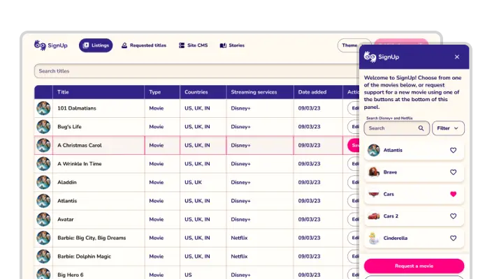
SignUp Captions provides media accessibility for the Deaf and and Hard-of-Hearing community through a free-of-charge Google Chrome extension that offers sign language interpretation on Disney+, Netflix, Peacock, and other streaming platforms.

"Stratosphere is far from your average tech team and SignUp Captions would not be what it is without them!

When I was looking for my tech team I interviewed quite a few companies. Stratosphere stood out for several reasons, but - above all - I value their culture. Their team displays soft skills that match the value of their technical knowledge. As well as being extremely knowledgeable and innovative, Stratosphere is not intimidating to a non-technical person, and they explain complex issues and solutions in a digestible way.

This is an adaptive team, and they have come up with ideas way beyond their remit. Our product needs to adapt to different countries and platforms, and the Stratosphere team has met these challenges head-on and with efficiency. Additionally, Stratosphere has supported Signup by attending meetings and pitches. They have interacted very well with clients and impressed potential partners. They have made videos for me to share with stakeholders and provided visuals that have been invaluable in showing our growth and progress. I asked them to work alongside a branding agency who had offered Signup some work free of charge, and Stratosphere's openness and willingness to collaborate ended in very good results, both for our Chrome extension and our website.

Stratosphere is supportive, professional, extremely capable, patient, friendly, and kind. Working with them makes my project and my working day better!"

— Mariella Satow, Founder

The Solution

Signup Captions had been scaling to reach a larger audience and provide additional accessibility content for their users, but their extension design was cumbersome and outdated and lacked needed functionality. We redesigned and rebuilt their extension to improve UX and expand functionality, and we also revamped their website.

Signup Captions

The Services

Supported Platforms

Chrome Extension

Previously, SignUp’s extension required the user to manually navigate to a chosen video both within the extension and within the streaming service and then sync the two. We recoded this so that the user can now launch the extension from any site, and selecting a title from the extension interface will automatically bring them to the corresponding title within the streaming service.

We added support for TV shows as well as additional streaming platforms across multiple countries. We also implemented video resizing, favoriting, filtering, multiple language support and auto-syncing.

Signup Captions
Signup Captions
Signup Captions
Signup Captions
Signup Captions
Signup Captions

Website

SignUp’s website was functional, but it didn’t represent what the extension had to offer, nor was it particularly inviting. We redesigned SignUp’s website to grab users’ attention and showcase extension features. We built out new sections highlighting available titles, and integrated a color scheme and images that provided a welcoming visual experience. In addition, we improved accessibility by updating the site’s contrast levels, adding in a dark mode, and optimizing the code for compatibility with site readers.

When an external branding company wanted to support SignUp’s mission by providing their services free of charge, we integrated their work into our designs and offered guidance on using their deliverables.

Signup Captions
Signup Captions
Signup Captions

Website accessibility

SignUp wanted to make sure that they were providing inclusive access to their content. To support their users with low vision, we designed and implement two additional high-contrast site themes:

Signup Captions
Signup Captions

Additionally, we refactored the website code to maximize compatibility with site readers and ensure that users could navigate through sections by hitting the tab button, without the need to click.

We also integrated the site with Signly, a synchronous reader that offers access to web content in sign language.

Signup Captions

Content Management System

We built SignUp a content management system that allows them to upload new titles, update corresponding images, add blog posts, and manage featured content.

Signup Captions
Signup Captions
Signup Captions
Signup Captions
Signup Captions

Donations

Since SignUp is powered by donations, they needed a way to invite users to support their service. We designed an in-extension prompt that appears at the end of a film or TV show and guides viewers to a page of donation options, including the ability to pay for a specific movie or TV episode to be interpreted.

Signup Captions
Signup Captions
Signup Captions

Invia

The Client

INVIA Medical Imaging Solutions provides software for nuclear cardiologists and other medical professionals. Nuclear cardiology is the leading, non-invasive, imaging technique for evaluating a patient’s risk of cardiac disease, and INVIA’s core product, 4DM, provides these doctors with 4-dimensional quantification tools for assessing cardiac health.

"Stratosphere was a pleasure to work with and we are grateful we chose them to assist us in our web development. Their strength was in their simplicity; they were able to understand what we wanted after a single explanation, outline a straightforward plan for achieving the goal, and develop to that plan with very little deviation. Their developers were sharp and experienced, seamlessly working with our team to quickly implement effective solutions. Having a consistent, reliable, and predictable partner with us through this project made all the difference in our ability to complete it on time. We strongly recommend their services."

— Ashley Emery, Senior Director of Program Management

The Solution

INVIA’s core product, 4DM, has provided a 4-dimensional quantification and review environment for medical professionals for over 20 years. However, 4DM was built as a Windows application, and could only run on computers it had been installed on. INVIA hired us to help engineer a web-based solution: a “thin client” version of their product that could run in a web browser on any secured network.

Since both time and budget were key considerations, we worked closely with INVIA to find the most efficient path forward for their MVP. The solution we landed on was a hybrid: a combination of front-end and back-end rendering. We creatively engineered this dance between the server and client on a feature-by-feature basis to optimize for responsiveness.

Invia

The Services

Supported Platforms

The App

Our design team worked closely with INVIA to improve 4DM’s user interface. We made incremental changes to modernize the application’s look and feel without alienating their longstanding user base.

Icons

We took INVIA’s original Windows application icons and translated them for the web. We optimized for efficiency by creating flat files and minimizing the colors involved. At each step, we triangulated between the original design choices, web standards, and more user-intuitive UI.

Invia Icons

Func & Quant

Invia Func Quant

MPI Summary

Invia MPI Summary

Screen Capture

4DM’s screen capture function allows users to capture an image or video. Since some of the web app’s canvas was coming from the server and some was drawn within the browser, we engineered a screen capture solution that composited server-side and client-side canvases into a single image or video.

Invia Screen Capture Viewer
Invia Screen Capture Options

Color Bar Slider

INVIA needed their users to be able to change the hue and saturation/contrast of images or video using 4DM’s color bar slider. In the web app, since the slider is on the client side and the images are rendered by the server, we programmed the interface to continuously pull updated frames in response to the slider position. To remove the risk of lag with animated content, we suppress animation while the user drags the slider and resume it upon release. We implemented similar solutions for the Magnification and “Cine” tools.

Scoring Maps

To improve UI responsiveness, we adapted this server-rendered feature to handle user input and render client-side.

Slice Control

This feature allows users to manipulate multiple cross-sectional image slices at the same time. We improved the overall UI, allowing synchronization of sliders and facilitating comparison of a given slice axis across multiple datasets.

Design System

The components we built for INVIA’s web-based version of 4DM can be used for additional features as new versions of the software are designed and developed.

Invia Design System

Security Integrations

In order to serve up patient data to its users, 4DM must also integrate with multiple secure medical file systems. We worked with external partners to come up with authentication solutions that satisfy HIPAA security requirements while giving users seamless access to the 4DM web app.

Emulate

The Client

Emulate creates living products for understanding how diseases, medicines, chemicals, and foods affect human health. Their Organs-on-Chips technology, which places human cells in micro-engineered environments, provides researchers with a new platform that predicts human response more accurately than cell culture or animal models.

“Stratosphere's expertise in building custom backend systems and designing and developing our responsive website and web app was truly outstanding. Their collaborative and innovative approach made the entire process seamless and efficient. We couldn't be happier with the results and highly recommend their services!”

-Marty Laurita, Principal, User Experience Design

Solution

Emulate contacted us in the hope that we could add functionality to their website and web applications while maintaining their brand standards. We’ve improved their website, built custom back-end content management systems, built a custom web app, and created a robust design library with components that can be directly pulled into their codebase, enabling interface changes to be immediately propagated throughout their applications.

Supported Platforms

Services

Stack

Website and Back-end Systems

A Custom Website With a Custom Back-end to Manage It

We worked with Emulate’s designers to update their existing WP Engine website by coding pixel-perfect responsive front-ends and performing quality assurance testing on all major browsers.

We built custom PHP modules for their back-end to customize almost every aspect of their website, minimizing the need for them to hire developers to make minor changes to text, images, animations, and layouts.

Web App

A Help Center, an eCommerce Store, and More

We built a web application that functions as a help center, enabling Emulate’s customers to create accounts, review scientific protocols, view FAQs, submit and manage tickets, and buy Emulate’s products through an eCommerce store. Additionally, we built back-end systems for Emulate to manage users, permissions, and invites.

Pattern Library

A Design System Built For Code

Working with Emulate’s designers, we helped design and coded a Vue.js pattern library that enables interface components to be directly pulled into code. This enables a robust and extensible development cycle whereby any interface changes can be immediately propagated throughout Emulate’s applications.

divvyDOSE

The Client

A startup founded by Dr. Arvind Movva in Rock Island, Illinois, divvyDOSE is a full-service online pharmacy that sorts medications into personalized packs and delivers them to customer's doorsteps. UnitedHealth Group purchased divvyDOSE for just over $300M in September, 2020.

"Stratosphere took us from conception to a fully functional customer facing online pharmacy with a website, web app, iOS app, Android app, and custom internal software systems to manage parts of our operations, all in less than a year. They are a very talented, efficient, and thoughtful team of software designers and developers. It’s clear that they genuinely care about the success of their client’s businesses. If you want your software to be visually appealing, functional, and ultimately successful, Stratosphere is a great choice. Or you could always have your cousin give it a go."

- Ted Thoms, Chief Marketing Officer, Shareholder
Visit Site

Supported Platforms

App A Full-Service Pharmacy at Your Fingertips

The divvyDOSE app provides a full-featured experience across the major platforms and browsers. We employed the Material Design visual language and a modular UI approach to quickly build a consistent, responsive experience that can easily adapt as the divvyDOSE feature set expands.

The app enables divvyDOSE customers to manage their entire pharmacy experience. Features include:

Signup Interface

Calendar

Marketplace

Medication List

Interface Icons

We designed a set of custom interface icons used throughout the app.

WebsiteA Friendly Smile and a Helping Hand

We designed and built a website highlighting the benefits of switching to the divvyDOSE pharmacy. The website is responsive and works across the major browsers.

Illustrations

We designed a set of illustrations to showcase the friendly persona of divvyDOSE.

Internal SystemsBridging Digital and Physical, Legacy and Modern

We can't get into the gritty details because they're top secret, but building software that plays nicely with medical systems and industrial hardware is a tricky business. We developed divvyDOSE's internal software that interfaces with legacy pharmacy software, personal health information storage systems, and a pill packaging machine. We also built a custom labeling, shipping, and billing system.

Konverse

The Client

Konverse is an internal communication and productivity platform that helps companies reach their employees in a timely manner, whether they’re in the office, on the go, or on the frontline. Their mobile and web apps replace emailing, task management, shared drives, customer support ticketing, intranets, and more with an intuitive, all-in-one solution.

“Working with Stratosphere Digital on our website and app UI/UX redesign has been a great experience. Their design knowledge has been key to helping us implement a vastly improved user experience for our clients that marries current design philosophies with the simplicity our users need. As an established company with a large number of existing users, we needed someone who could ask the right questions, understand our current challenges, and help us create a new experience that didn’t lose the simplicity and clarity of our current design. The Stratosphere team was able to quickly get up to speed and become true collaborators in the creative process. The success of our updates is in large part due to the collaboration, knowledge, and hard work of the Stratosphere team.”

- Danny Wheeland, Vice President of Customer Experience at Konverse

Solution

Konverse’s app was considerably more advanced and feature-rich than their competitors’, but their design was outdated. As a result, they were losing business to apps with worse features but better UI/UX. We performed a complete audit of Konverse’s existing design assets and then developed a new look and feel that maximized user appeal, intuitiveness, and discoverability. From there we designed and built Konverse a new website, crafted updated web copy, and produced marketing materials, including a promotional promo-video and pitch deck template.

In addition, we redesigned the UI/UX of Konverse’s web and mobile applications to give users a consistent, high-quality experience across their platform. This involved producing an extensive design pattern library that could be easily themed with the different brand colors used by Konverse’s customers.

Services

Supported Platforms

Website

We designed a new website with custom animations and updated Konverse’s web copy to reflect a more modern brand.

We created a collection of illustrations based on a set of style principles and practices to use throughout the site.

Marketing Materials

Marketing Materials

We created a head-turning promotional promo-video by traveling to record on-site interviews with some of Konverse’s key customers, and we designed a templated deck for Konverse’s sales team to pitch to Fortune 500 companies.

Konverse Promotional Video

Hyatt Hotels Case Study

Follett Case Study

@properties Case Study

Better Homes and Gardens Real Estate
Metro Brokers Case Study

App

We redesigned Konverse’s mobile and web apps from the ground up. And to save their developers time and effort, we also produced an extensive design pattern library so that their team could easily code the new designs using components.

goodpill

The Client

Good Pill is non-profit home-delivery pharmacy driving the future of healthcare forward by providing affordable access to prescription drugs from donated surplus stock.

"Stratosphere has an incredible understanding of modern software development applied to the healthcare space. Our ability to build out our internal logistics systems and our consumer-facing applications has become a lot easier since we began working with them. We feel lucky to have found their team of talented designers and developers."

- George Wang, Co-founder

Solution

Good Pill has been growing rapidly and struggling to find technical talent with experience in the pharmacy and HIPAA-compliant space. We built from scratch a suite of HIPAA-compliant web applications to manage patient data.

Good Pill Solution Screenshot

Services

Supported Platforms

Pharmacy Management App

We designed and developed an internal web application to manage patient data, including patients’ prescription medication and order history, making it easier to ship medications to patients that were donated by healthcare organizations, as well as to keep track of medication inventory to ensure that upcoming orders can be filled.

Good Pill Pharmacy Management App Screenshot 1
Good Pill Pharmacy Management App Screenshot 2
Good Pill Pharmacy Management App Screenshot 3
Good Pill Pharmacy Management App Screenshot 4
Good Pill Pharmacy Management App Screenshot 5
Good Pill Pharmacy Management App Screenshot 6
Good Pill Pharmacy Management App Screenshot 7
Good Pill Pharmacy Management App Screenshot 8

In-code Components

We built a library of components in code that are used across all of these apps, speeding up development and making everything easier to maintain.

Good Pill Component Library 1
Good Pill Component Library 2

Axios

The Client

Axios International is a pioneering healthcare access company that has stood at the forefront of the industry for nearly 25 years. They tackle access challenges in emerging markets with solutions that address the changing needs of patients, the pharmaceutical industry, and government and organizational stakeholders. Their patient access solutions have been implemented in more than 100 countries across the globe.

“Working with Stratosphere Digital was a great experience! The team was always available, friendly and knowledgeable about web and app design. There was never any problem, always fruitful design discussions and creative solutions. Once the style exploration was finished and a clear look and feel chosen, the screens were designed quickly and qualitatively. Overall, it was seamless and the designs were delivered ‘key in hand’ for the dev team to implement right away.”

- Raphael Itah, Head of Digital Health at Axios International

Solution

Axios was preparing to launch a new generation of innovative digital solutions used by patients, physicians, pharmacists and pharmaceutical companies involved in Axios-managed Patient Support Programs. They were looking to enhance the UI/UX of their mobile and web applications, so they reached out to us to redesign their suite of tools. We started with existing prototypes and explored style variations until we had a look and feel that Axios loved. We retooled their UX to optimize intuitiveness and deliver an experience their users would enjoy. And because we know what a headache design implementation can be for developers, we built production-ready assets using a design system in Figma, ensuring that each piece of the project met industry standards.

Services

Supported Platforms

MyHealth for Patients

The MyHealth mobile app makes it simple for patients to track and manage their treatment.

With MyHealth, patients can:

MyPatients for Physicians

With the MyPatients mobile app, physicians can refer patients to a Patient Support Program with a few easy clicks and then effortlessly follow up on their progress at their own convenience.

With MyPatients, physicians can:

MyPharmacy for Pharmacists

The MyPharmacy app allows pharmacists to seamlessly dispense medications to patients from one centralized location.

With MyPharmacy, pharmacists can:

MyPrograms for Pharmaceutical Companies

The MyPrograms web application provides unparalleled live data access to pharmaceutical companies, reflecting up-to-date program performance.
With MyPrograms, companies can:

Patient Management System (PMS)

The PMS centralizes the data from all Patient Support Program processes into one platform, while optimizing stakeholder management and engagement.

The PMS achieves this by:

Style Exploration

We explored style variations until we had a look and feel that Axios loved.

Style 01

Straightforward, Crisp

Style 02

Friendly, Soft

Style 03

Clean, Spacious

Barrys

The Client

Barry’s Bootcamp is a global fitness brand that delivers high-intensity workouts by inspiring instructors in a uniquely high-energy environment. Since its founding by Barry Jay and John and Rachel Mumford in 1998, Barry's Bootcamp has been delivering The Best Workout in the World® to a legendary following, including A-list celebs, models, and even Olympic athletes.

Visit Site

“We have partnered with Stratosphere for nearly two years to improve visibility into our business and enable our teams to make more data-informed decisions. Over the course of the partnership, the Stratosphere team has demonstrated strong teamwork and the technical capabilities necessary to help us accomplish both our near-term and long-term strategic goals.”

- Steve Padis, Vice President, Strategy & Business Development

Solution

We developed custom internal data and reporting systems for more than 70 Barry’s Bootcamp fitness studios. We then integrated those systems with multiple fitness scheduling APIs, allowing for custom report generation. This enables the studios to have daily and weekly reports automatically sent to them, rather than having to manually create email reports, and gives each studio a clear snapshot of how they’re performing across dozens of relevant metrics.

We also created summary reports for Barry’s executive team so that they can better understand their business and make their important decisions based on real data.

Lastly, we helped connect Barry’s data to DOMO, a cloud-based data management platform which helps executives manage their business.

Services

Sirum

The Client

SIRUM is a drug-donation platform driving the future of healthcare forward by connecting people with donated surplus medications at affordable prices.

"As a non-profit medicine-donation platform that runs largely on custom-built technology, it’s crucial to find a team of developers and designers who can understand how our business works and turn our ideas into reality in a scalable and secure way. Stratosphere is that team. Their deep understanding of the healthcare space has allowed us to supercharge our design and development progress. They are great listeners, great designers, and great developers, and are genuinely passionate about what they do."

- Adam Kircher, Co-founder

Solution

SIRUM has been growing rapidly since going through Y Combinator in 2015. With that growth came the struggle to find technical talent with experience in the pharmacy and HIPAA-compliant space. We jumped into SIRUM’s tech stack and worked with their team to build a HIPAA-compliant web application to manage donated medications, and a HIPAA-compliant web application serving as a donor portal for organizations who donate surplus medications.

Sirum Solution Screenshots

Services

Supported Platforms

Donation Management App

We designed and developed an internal web application to track and manage donations of medications from health facilities and pharmacies.

Sirum Donation Management App Screenshot 1
Sirum Donation Management App Screenshot 2
Sirum Donation Management App Screenshot 3
Sirum Donation Management App Screenshot 4
Sirum Donation Management App Screenshot 5

Donation Portal

We designed and developed a web application that serves as a portal for SIRUM’s donor partners.

Sirum Donation Portal App Screenshot 1
Sirum Donation Portal App Screenshot 2
Sirum Donation Portal App Screenshot 3
Sirum Donation Portal App Screenshot 4
Sirum Donation Portal App Screenshot 5
Sirum Donation Portal App Screenshot 6

Inventory & Operations apps

To more efficiently sort and process donated prescription medicine, SIRUM needed a web app that could integrate with their SureSort equipment and allow their team to identify and stock new items with maximum efficiency. We built them a set of apps to manage this process:

Sirum Inventory & Operations App Screenshot 1
Sirum Inventory & Operations App Screenshot 2
Sirum Inventory & Operations App Screenshot 3
Sirum Inventory & Operations App Screenshot 4
Sirum Inventory & Operations App Screenshot 5

Drug UI

SIRUM needed a separate web application to manage details and configuration for specific drugs. We designed and built an interface that allows them to update their database of NDCs, acceptance thresholds, prices, stock levels, recalls and more.

Drug UI App Screenshot 1
Drug UI App Screenshot 2
Drug UI App Screenshot 3
Drug UI App Screenshot 4
Drug UI App Screenshot 5

In-code Components

We built a library of components in code that are used across all of these apps, speeding up development and making everything easier to maintain.

Sirum Component Library

Discord

The Client

We worked with Discord to produce an updated series of logo icons in the style of Google's Material Design.

"Stratosphere’s team came to the initial brief with exceptional concepts and consistently followed through on our vision."

- Mike Arndt, Director of Design at Discord

Services

Supported Platforms

Calendar Bridge

The Client

CalendarBridge is a tool that allows users to sync all of their digital calendars in order to keep their schedules accurate and up-to-date, no matter which calendar app they are looking at.

"Stratosphere’s team jumped in and worked directly with our developers to design clean and beautiful UI/UX for our app. They quickly understood our product and customer base and was able to smoothly guide us through the design process while considering all of our technical constraints. They are incredibly talented technical designers and their work screams thoughtfulness and attention to detail. I feel lucky to have found their team."

- Paul Everton, Founder of CalendarBridge

The Solution

CalendarBridge came to us with a partially built design that they wanted us to improve upon. Their booking and syncing features were functional, but in a way that was not UX-friendly. They knew they wanted to upgrade their overall UI, as well as reduce the complexity of their product and save time on development.

We worked with their CEO to understand the project scope and priorities, met with their creative director to develop their branding, and strategized with their development team to identify and meet their unique technical constraints. We refined CalendarBridge’s web app’s UI and found ways to trim corners that not only avoided compromising product quality, but improved the overall user experience as well.

Sirum Solution Screenshots

The Services

Supported Platforms

Web App

Scheduling

CalendarBridge came to us with a loose proof of concept for their scheduling tool, which we developed into a production-ready feature. This tool allows users to facilitate group event scheduling by finding times that work for everyone, regardless of which calendar programs they use or what organizations they belong to. In addition, the booking and syncing features allow users to set up automatic responses to invitations based on their availability.

Calendar Bridge Scheduling

Booking

CalendarBridge booking allows users to set up a schedule of availability and create a unique landing page where they can receive appointments.

Calendar Bridge Scheduling

Syncing

The system we designed syncs a user’s schedules across apps so that all their events display and update automatically.

Calendar Bridge Scheduling

Illustration

A set of feature illustrations for the app’s dashboard.

Full Design Library

In addition to improving CalendarBridge’s web app, we built them a full design library to support their brand continuity in future projects and across platforms

CalendarBridge Design Library

Opyn

The Client

Opyn (formerly Transparent Health Marketplace) is an innovative platform connecting payors and providers in a new marketplace model for the procurement of workers’ compensation healthcare services. By automating manual processes and eliminating redundancies, Opyn delivers greater efficiency and cost savings for payors, new referral opportunities for providers, and better outcomes for all stakeholders in the workers’ compensation industry.

The Solution

Opyn had developed an innovative and intricate service that was ultimately difficult to understand and navigate. They reached out to us in order to update their brand to be more modern and professional, to improve their UI/UX to be more intuitive, and to design new information-rich dashboards that wouldn’t overwhelm their users.

The Services

Supported Platforms

Internal Tools

Payor App

Submit and manage workers’ claims for providers to bid on.

Provider App

Review and submit bids on claims in the marketplace.

Admin App

Organize and streamline claim management between payors and providers across the service.

Web PR

Dashboard

See information at a glance and easily navigate through the app.

Reviews

View, search, and sort reviews.

Listing Presence

View, manage, and improve listings.

Analytics

Manage your audience and see your growth over time.

Mentions

Get involved in the discussion wherever it’s happening.

Vasa

The Client

Vasa is a healthcare technology company working to make home health services accessible, interoperable, reliable, and affordable by connecting patients with mobile care wherever they are with one low-cost monthly membership. They aim to become the gold standard for on-demand healthcare in the United States.

Vasa—which means vessel in Latin—offers services including at-home IV infusions and blood draws, telehealth, ambulatory care, comprehensive lab testing, prescription management, remote patient monitoring, and nutrition counseling.

“I had a vision of the app I wanted to launch, and I needed a team to help me achieve just that. From the very first meeting, Stratosphere took the time to understand my vision and worked towards making it a reality. They were diligent and receptive to every minute change and took on the bigger picture for me. In them I found a team that understood what I wanted and took notes in every meeting to steer the project in the right direction. I trust Stratosphere with my project. Stratosphere's unique and meticulous designs and their viewpoint are bringing my vision into reality.”

- Humza Khan, CEO/Founder

Solution

We developed a suite of brands to enter the mobile healthcare market and designed and developed a website, marketing materials, and mobile apps.

Services

Brand

We developed a suite of brands for Vasa, giving them a robust collection of platforms, programs, and apps with which to enter the healthcare market.

Marketing Materials

We designed a plethora of marketing materials to help Vasa represent and launch their brand.

Flyer

Event Invitation

Event Banners

Business Cards

IV Bag Labels

Van Wraps

Social Media Graphics

Website Landing Page

We designed and developed a landing page to capture interest in Vasa’s launch.

App Design

We designed and developed mobile applications to redefine healthcare with mobile technology at the core of the user experience.
Interface Component Library

Wecora

The Client

Wecora is an online visual presentation and collaboration tool targeted at creative professionals, particularly interior designers. Wecora helps professionals collect products and inspiration, organize jobs, and facilitate discussions with clients.

Visit Site

Solution

We built a native iOS app using a modified Material Design style that we previously developed for Wecora’s web app. Our focus was on simplicity and clarity for non-tech-savvy users.

“We consider discovering Stratosphere one of the best breaks we’ve had thus far with building out the Wecora solution. After many discouraging, overcomplicated and costly partnerships that lead to painful hand-holding and uninspiring results, Stratosphere’s approach was refreshingly relaxed yet extremely productive.

We simply provided the walls in which we wanted his team to structure our app redesign, then they took the concept and ran with it in a way that was thoughtful and attentive to even the most minute detail. After working with these guys, we are confident now of where to land our ideas and already have several on-going projects in their pipeline!”

- Stephanie Dixon, Wecora Co-Founder

Services

Supported Platforms

Wecora Capture A streamlined iOS app

We designed and coded a native iOS app using the Swift programming language and a modified Material Design style that we previously developed for Wecora's web app.

Wecora Web App Redesign An easy to use, responsive web app interface

The main focus of the Wecora web app redesign was to transition to a custom Material Design style and to simplify the interface for non-technical and older users who had difficulty reading or finding things on the screen. We increased the font size, placed visual emphasis on the primary user actions, and were deliberate about distinguishing different kinds of objects within the screen.

In the demo linked above, you’ll notice that all interactive elements respond to the cursor with gentle hover-and-click animations, offering ease of use and visual comfort to users.

The redesign also accommodates mobile screen sizes by making use of Material Design conventions.

Caster.IO

The Client

Caster.IO is an education platform for professional Android developers. The company works with top developers in the industry to produce concise video tutorials on a wide range of Android development topics offered through a subscription-based model.

“I come from a background of mixed media and design, so finding a group that matches my high expectations has been challenging. However, upon reaching out to the team at Stratosphere Digital, I found that luck had finally paid me a visit.

I hired them to design a custom logo and redesign Caster.IO. From the initial video conference consultation, I found their inquisitive, probing analysis of the project very welcoming. From uncovering concepts, design considerations, user experience recommendations, accessibility implementations, and more, Stratosphere Digital demonstrated that they were the elite group I’d been looking for.

From that point forward, they continued to deliver exceptional design, front-end development, and product direction that ultimately helped turn Caster.IO into what it is today: a learning destination for thousands of professional developers. Stratosphere Digital worked within the product specifications, stayed on budget, and delivered all projects before their deadlines. They continue to deliver outstanding results for all projects we have requested and we look forward to a long relationship with them.”

- Donn Felker, Caster.IO CEO

Solution

We designed a logo and established a new visual identity for Caster.IO. We teamed up with developer Carlos Jeurissen for a complete visual and technical overhaul of their website and online presence. We created over 60 course illustrations, as well as a template for generating new ones. We continue to work with them to design and implement new features as their site and subscription base grows.
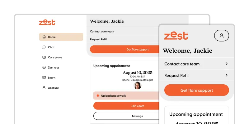
Services

Website Redesign

New Logo

ConveYour

The Client

ConveYour is a microlearning platform that enables influencers, trainers, and organizations to engage with their audience in a new and effective way—with personalized, bite-size content; mobile-first courses and campaigns; and interactive challenges. By tailoring their content to the specific needs of their audience, companies using ConveYour build a deeper connection to them.

Visit Site

“As a self-funded startup founder, I’ve had to get good at wearing many different hats. For the longest time, the product design hat was one I thought I wore just fine. Yes, user experience and user interface design had always been an area of pain for our team, but it didn’t stop us from shipping product. As ConveYour grew, it became painfully obvious that user experience and clarity had to improve in order to efficiently scale the business.

There was a time where building cool functionality and telling people about it was a business model. Now there are over 7,000 marketing tech SaaS companies alone. The customer has ultimate choice. One cannot just compete on functional merits alone; the customer experience is paramount.

Working with Stratosphere Digital has been downright incredible. Stratosphere brings a level of thought and earnestness to customer experience that I’ve never seen before. Yet, their pace is fantastic. Stratosphere’s work has replaced many of our okay product ideas with masterpieces that can contend with the biggest and the best in ConveYour's industry.”

- Stephen Rhyne, ConveYour Co-Founder

Solution

We started our work with ConveYour by doing an audit of their existing design and UX. From there, we established a set of initial goals for a complete redesign of the Learning Portal section of their app. We worked closely with ConveYour to improve the structure, navigation, and feature set of the product.

The redesign was not only an aesthetic refresh, but also the establishment of a growing library of design components, patterns, and assets for use in the current Learning Portal. When the redesign was completed, we worked directly with ConveYour’s developers to support and oversee the implementation. We continue to work with ConveYour on improvements to their app as well as new, unannounced projects.

Supported Platforms

Services

Themes and Whitelabeling

Our redesign needed to accommodate and improve the performance of the Learning Portal’s light and dark themes, as well as allow users to set their own primary color and logo. We designed sets of interface elements that worked well in both light and dark modes, and established a balanced, consistent use of primary colors while maintaining high contrast for key content.

Design Library

Underneath the new interface is a collection of improved and expanded design components, navigation patterns, and graphic assets. These elements accommodate responsiveness and themeability. Items in the library are then built out as Vue components, enabling ConveYour’s developers to jumpstart the creation of new features and products.

The Client

Fresher (previously Fitness Ration) is a startup based in Singapore that prepares precisely calibrated, nutritionally balanced meals based on specific fitness goals and delivers them to customer’s doorsteps.

Visit Site

“Stratosphere worked to understand our needs and tailored a solution that fit perfectly. They helped us build fully custom software systems to run the entire back end of our business and also coded our consumer-facing web application to be pixel-perfect based on the designs we provided. I highly recommend Stratosphere's team if you're looking for a solution that requires custom coding.”

- Jerome Seow, Fresher Co-Founder

Solution

Starting from designs provided to us, we built a responsive website to showcase Fresher’s beautifully prepared meals; an order wizard to streamline and simplify the experience of purchasing meals, user accounts to enable the managing of customer profiles, preferences, and order histories, and custom internal software to make processing, scheduling, and delivering orders easy and accurate.

Supported Platforms

Stack

Website

Starting from designs provided to us, we built a website that highlights Fresher’s prepared meal products, including an order wizard that takes the customer through a simple process to select which meals are right for them. The website is responsive and works across all major browsers.

App

Starting from designs provided to us, we built a responsive web app that enables customers to create an account and maintain a basic profile, which includes commonly ordered meals, allergy info, and an order history from which they can quickly reorder previously purchased meals.

Admin Systems

We built internal admin systems used by the Fresher team to manage the entire backend processes of their business. Features include:

LeadSimple

The Client

Founded in 2013, LeadSimple seeks to help property managers “tame small business chaos.” Their sales and workflow automation software combines CRM, communications, and process management into one easy-to-use system.

“Working with Stratosphere Digital was a great experience. They are very knowledgeable and were able to transform our product from it's previous design into something that was new and with more personality, but still familiar to our existing users. They were organized, made sure we were kept up to date on what they were doing and were fun to collaborate with along the way. I would recommend Stratosphere to any company looking for professional assistance designing a new software product or app or redesigning an existing one. Great work guys!”

-  Matt Berkompas, Lead UX/UI designer

Solution

LeadSimple’s team had begun overhauling their app’s visual design in conjunction with the development of new functionality. We were brought in to assist their lead designer in both figuring out the new style and developing new UI components and UX patterns around core functionality.

We started with a detailed review of both their existing product and the new feature documentation. Key members of their team shared issues and goals that they hoped to address. With our support, LeadSimple was able to develop and apply their new style and UX patterns app-wide.

Services

Supported Platforms

App

Sales and Workflow Automation for Property Managers

Relationships

Contacts

Settings

Deals

Tasks

Style Exploration

RoadWarrior

The Client

RoadWarrior is a multi-stop route planning service for drivers and dispatchers looking to cut time on the road. Its apps combine custom route flexibility with algorithms that maximize efficiency and account for variables ignored by other navigation software.

Solution

Both of RoadWarrior’s apps, RoadWarrior Mobile (for drivers) and RoadWarrior Teams (for dispatchers), had been initially designed by in-house developers. RoadWarrior brought us in to take their existing, disjointed designs and create a more consistent, contemporary product. We started with a full UI/UX audit of both apps to highlight potential issues and opportunities for improvement. We then revamped the user experience and worked with RoadWarrior to design new features and functionality. In addition, we created screenshots for the mobile app’s listing and graphics for its user guide and website.

Services

Supported Platforms

RoadWarrior Mobile

RoadWarrior Mobile offers route optimization for couriers, delivery drivers, door-to-door salespeople, or anyone with many stops along their route.

RoadWarrior Teams

RoadWarrior Teams gives dispatchers a way to handle the complexities of rigorous, multi-stop routes and optimize fleet management. With the app, companies can easily keep track of their drivers and update routes in real-time.

Creating a Unified Design

Our challenge was to come up with a design that felt familiar, but better and cleaner. And while we freshened up and simplified some of RoadWarrior’s previous designs, we also built on their original concepts, fleshing out the style ideas they’d been aspiring to.

To reduce extraneous UI patterns and establish a more consolidated and robust vision, we first performed an inventory of each pattern component to account for any edge cases. We then created a set of unified UI patterns that could be used across both web and mobile apps, minimizing developer workload and maximizing the intuitiveness of the UX.

FallCall

The Client

FallCall is a Connecticut-based startup founded by physicians who wanted to provide elders and their caregivers with an alternative to the bulky (and often stigmatized) “help button.” They offer simple, downloadable monitoring and communication systems for mobile devices.

“Working with the Stratosphere team was an absolute pleasure. Their understanding of iOS and WatchOS is world class and their ability to tackle challenges on each of these platforms led to app performance enhancements that were greatly appreciated by our management team and our users. They are readily accessible and personable regardless of the problem. I highly recommend Stratosphere to anyone in need of a highly competent app development team!”

- Shea C. Gregg, MD FACS, Founder and President

Solution

In addition to developing and launching new features, we performed ongoing maintenance, bug fixes, and testing for FallCall’s iOS and Apple Watch apps.

Stack

The App

A standalone iOS App and WatchOS App that work together to provide:

Zingfit

The Client

zingfit is a startup based in Boulder, Colorado, that offers online scheduling and engagement software for boutique fitness studios.

Visit Site

“After working with several other sub-par developers, Stratosphere jumped into our custom and complex code base, making changes and improvements quickly and efficiently. Stratosphere successfully executed on tasks that other developers didn't even think were possible. I highly recommend Stratosphere if you're looking for a top-notch team of software developers.”

- Jeremy Firsenbaum,
zingfit Co-Founder/CTO

Solution

We helped build and maintain the internal software that manages and deploys the web and mobile apps of zingfit’s fitness studio customers from around the world.

Stack

Platform28

The Client

Platform28 is a leading cloud communications platform used by government agencies, private enterprises, and the nation’s largest telecommunications providers. They offer a range of services, including cloud-based telecommunication software, professional support, and advanced APIs.

Visit Site

“Stratosphere helped us with fresh designs for our iconography, UI/UX, and graphics, and did a fantastic job. We really appreciate their creativity, intelligence, and how quickly they were able to understand our industry. Stratosphere produces and provides excellent value.”

- Mark Ruggles, Platform28 CEO

Solution

We provide ongoing design support to Platform28 in multiple ways. We create logos for their products and services, design the UI/UX of their web and mobile apps, and create graphics for their promotional materials and presentations.

Services

App Design

Presentation Graphics

Product Icons

PSafe

The Client

PSafe is a global leading provider of mobile apps designed to protect people’s freedom to safely connect, share, play, express, and explore online. The company boasts over 130 million installations of their innovative privacy, security, and performance apps.

Visit Site

“The promise I made to my client is that we will be creative, collaborative, and utterly reliable. Talent like Stratosphere allows us to live up to that promise. Stratosphere’s work is precise, elegant, and always well thought through. Unlike many designers who can make beautiful things but can't explain why they make sense, Stratosphere always has a strong and clear perspective on their work, which is appreciated by my clients and by my wider team. There will always be room on my squad for Stratosphere.”

- Nick Strada, Founder of The Venturous

Solution

We collaborated with Intrepid SF, a new agency in the Bay Area that was helping PSafe remodel its brand architecture and revamp its visual brand identity in preparation for a major push into the North American market.

Our particular focus was on refreshing PSafe’s suite of product icons. We merged two product groups into one unified group and created a new visual style that was minimal, vibrant, and stylistically balanced between the Android and iOS platforms. We designed a set of icons on top of a grid, with shapes that adhered to a consistent set of style patterns.

The result was a reimagined set of icons that will serve as the foundation for future PSafe product icons.

Services

Twigs

The Client

Twigs is a fashion boutique in Madison, Wisconsin that offers a mix of apparel and accessories from top designers.

Visit Site

Solution

Starting from designs provided to us, we built a responsive website on top of the Silver Earth eCommerce platform to showcase Twigs’s collection of fashion apparel and accessories. We worked directly with Silver Earth to develop an improved checkout process, a user review system, and improved product pages.

Supported Platforms

Stack

Website

Starting from designs provided to us and using the Silver Earth platform, we built a website to make it easy for customers to purchase products, create an account with saved preferences, write product reviews, and create and share wishlists. The website is responsive and works across the major browsers.

Web Video Caster

The Client

Used by millions of people, Web Video Caster is an Android app that streams videos from your favorite websites onto your TV. Not only does it let you watch movies, TV shows, sports broadcasts, and live news streams, but it also allows you to cast local videos stored on your phone.

"Stratosphere has been an invaluable partner in our app development journey. Since 2016, Stratosphere's team have provided exceptional guidance and expertise, transforming our initial concept into a reality. Their flexibility, knowledge, and collaborative approach make them a pleasure to work with. We highly recommend Stratosphere!"

- Carlos Solorzano, Owner
Check Out The App

Solution

The redesign focused on simplifying the UI and refining the Material details. The app now boasts a distinctive charm, thanks to its friendly mascot and a series of illustrations to help users with the more complex elements of the app, such as error messages and the initial onboarding experience.

Services

Supported Platforms

Interface Refinement

Harnessing Material Design conventions, each screen of the app was cleaned up and refocused.

Even the most reliable streaming video services can have issues occasionally. Personal and sympathetic messages, as well as illustrations with opportunities to contact tech support, help defuse frustration. Emotion-driven messaging and illustrations help defuse users’ frustration by offering empathy and providing opportunities to contact tech support.

Mascot

We designed a friendly mascot to help liven up the app, improve the onboarding experience, and increase conversions to the paid version of the app.

Icon Design

After extensive design exploration, we arrived at a new product icon that weaves together symbolism of Chromecasting, browsers, and video, while capturing the spirit of Material iconography. We made a careful effort to come up with an icon that was not too similar to the wider family of relevant Chromecast trademarks, but was similar enough to remain recognizable and familiar to the user.

Ping

The Client

Ping is the world's smallest GPS locator for kids, pets, bikes, luggage—or anything that moves.

The Solution

We designed an app and validated its interface by testing a wireframe prototype with a diversity of users in the client's target demographic. We then used user feedback to design the consumer version of the app, including a logo.

Services

Supported Platforms

Interface Highlights

The app is designed to help new users quickly set up the Ping GPS device and sync it to their Ping smartphone app. Once set up, the app is ready to locate paired devices, providing confidence and comfort to users. The app design is clean and warm, with soft shadows, gentle color gradients, and bright accents.

Logo

The Ping logo establishes a visual link with the Ping GPS device and the Ping app icon. The letters have a consistent width and are based on repeating circles cut to different lengths, evoking a sense of reliability, friendliness, and simplicity.

Agora

The Project

Agora is an online shopping solution that overlays useful features on top of existing online retail websites. We built a system to scrape the details of products across retail websites, as well as an interactive Chrome extension that allows users to grab products right off the page from top retail sites and save them in one organized place. This ambitious startup project is still in development.

Promotional Video

We worked with a video production agency to write, shoot, and edit a video to promote Agora.

Stack

We brought together many different technologies to create a single coherent product.

Main Features

Iconography

We designed a set of custom interface icons used throughout the product.

Promotional Material

We designed a series of promotional materials to showcase the features of Agora.

Web Scraping System

We built a sophisticated web-scraping system to accurately get up-to-date product information directly from the product page being viewed.

Cookicons

The Client

Cookicons is an iconography side project of Stratosphere designer Michael Cook. He has been commissioned by a wide range of clients, including independent developers, non-profits, startups, and established companies.

Visit Site

Solution

Michael makes vibrant, high-performance Material Design app icons for Android, iOS, and the web.

Material Design is a visual style and design framework introduced by Google in 2014. It centers around thinking about interfaces as sheets of versatile digital paper that cast shadows based on their elevation.

The documentation for Material Design contains a section on iconography with brief guidelines for sizing, geometry, color, and lighting. You can view those guidelines here.

Michael's deep familiarity with Material Design documentation has allowed him to take it a step further with Cookicons. He has homed in on the spirit and nuance of the style and uncovered many details present in Google's icons but absent from the guidelines.

Each icon is custom made through a process that considers an app's feature set, personality, and competitive landscape. These factors are brought together to present compelling symbolism with strong composition.

In addition to carefully considering the issues of clarity and aesthetics, Michael performed icon A/B testing during the design process to achieve a boost in install rates.

Services

Supported Platforms

Cookicons Icon

Android Summit 2017: Adaptive Icons - Case Studies & Principles of Design

Droidcon NYC 2016: Material Icon Design Workshop

Papermill Collective

The Client

Papermill is a collective of Material Design enthusiasts who specialize in illustration; icon, product, interface, and motion design; and mobile and web development.

Visit Site

Solution

The website is a demonstration of Material Design, a comprehensive design language produced by Google for use on mobile and the web. The Papermill website meticulously adheres to the guidelines of the design language, but also goes further with bold animation and illustration.

Services

Supported Platforms

Logo

The logo reflects the core concept of Material Design: digital interfaces comprised of overlapping sheets of digital paper at different elevation. Papermill strives to be straightforward, proud, and hard working, and
the icon is designed to function as a mark of quality.

Design Showcase

Submit the form below and we'll email you a PDF showcasing more design details from client projects featured on our website as well as unpublished work.

After you’ve had some time to review our designs we will reach out to you about potentially working together.

We will not sell or provide your information to any third-parties, ever.

Great Success.
Sending PDF

Fiddlesticks.
The message failed to send.

Top 5 Common Mistakes to Avoid in Software Development

Software development is a complex process that requires careful planning and execution. However, even the most experienced developers can make mistakes. In this blog post, we will discuss the top five common mistakes to avoid in software development.

  1. Failing to plan properly: Proper planning is essential for the success of any software development project. Without a clear plan, it is easy to get sidetracked and lose sight of the project's goals. To avoid this, make sure to create a detailed project plan that outlines the scope, timelines, and resources needed for the project.
  2. Not testing thoroughly: Testing is crucial to ensure that the software is functional and meets the requirements of the users. However, many developers skip or rush through testing, which can lead to defects and issues in the final product. To avoid this, make sure to thoroughly test the software at every stage of development and fix any issues that are discovered.
  3. Not considering scalability: As the user base of a software grows, the software needs to be able to handle the increased load. If the software is not designed with scalability in mind, it may become slow or crash under heavy usage. To avoid this, make sure to consider scalability when designing and developing the software.
  4. Ignoring security: In today's world, security is a critical concern for software development. Ignoring security can lead to vulnerabilities that can be exploited by hackers. To avoid this, make sure to include security measures in the design and development of the software, and regularly test and update the security of the software.
  5. Not seeking feedback: Feedback from users is essential for improving the software and ensuring that it meets their needs. Ignoring feedback can lead to a software that is not aligned with user expectations and may not be used as intended. To avoid this, make sure to seek feedback from users throughout the development process and incorporate their feedback into the software.

In conclusion, proper planning, thorough testing, scalability, security, and seeking feedback are essential to the success of any software development project. By avoiding these common mistakes, developers can ensure that their software is functional, reliable, and meets the needs of users.

More Articles

6 Questions You Should Ask Before Working with a Software Development Agency

The Benefits of Continuous Integration and Delivery in Software Development

Our Philosophy on Building Trust and Managing Client Expectations

Comparing JavaScript Libraries: Vue.js, Angular, and React

Frontend, Backend, Fullstack: What Do These Mean?

Avoiding Hidden Costs in Software Development

How to Maintain HIPAA Compliance in Software Development for Web and Mobile Apps

Invisible Software Development Costs Caused by Technical Debt

How We Think About the Project Manager Role

Why You Should Start with a Minimum Viable Product (MVP)

Why We Engage Almost Exclusively on Retainers

How Much is My Software Project Going to Cost?

Why You Should Write a Specifications Document Before Starting Any Software Development Project

The Importance of a Single Source of Truth for Software Development Projects

What We Look for in a Client

6 Questions You Should Ask Before Working with a Software Development Agency

Building software is rarely a simple task, and many businesses don’t have in-house developers who can effectively develop and maintain the software they need.

That’s why many businesses choose to hire software development agencies to build and maintain their software.

Why work with a software development agency?

A software development agency knows how to build software from the ground up and can turn your ideas into software that is extensible and easily maintainable. They can write code that not only does what it’s supposed to, but that also doesn’t cost a fortune to maintain. Many businesses don’t consider the cost of ongoing maintenance and feature development of their software, which often ends up being significantly more than the cost of initial development.

So how do you find the right software development agency to work with? Sure, it’s tempting to just pick the first agency you find, but it’s generally a good idea to shop around before making a decision. There are a number of things you should consider before choosing an agency to develop your software.

Here are 6 questions you should ask a software development agency:

  1. Can you tell me more about your agency?

    This might sound obvious, but a lot of people skip this simple question.

    Getting to know the agency you might be working with is an important step. It’s the first step, in fact, of developing a relationship with them. You need to find out how their agency works, how long they’ve been in the business of software development, if they outsource work to junior developers, what they’re good at, and what they’re not so great at.

  2. Can I see some of your previous projects?

    Just like with any job, the hiring party should look for a portfolio or compilation of past works to determine if the applicant is a good fit given the specific requirements of your project.

    You should look into their past projects to see how well they developed the software and what the final products looked like. You should also try to get ballpark numbers regarding initial cost and ongoing cost.

  3. Would it be possible to speak with your past clients?

    At job interviews, applicants are often required to submit character references. This gives the employer a direct channel to individuals who know the applicant well.

    The same applies when hiring an agency. It’s incredibly valuable to get insight from people who have worked with the agency in the past. They can answer any questions you might have, such as what it was like working with the agency, how well they communicated, how organized they were, what problems came up, and how they handled those problems.

    The benefit to speaking directly to past clients is that it gives you an idea of the agency’s work ethic and general values, which can be equally as important as technical experience. You don’t want to be working with an agency that might have very different values than you.

  4. How do you communicate with your clients?

    Every agency should be able to give you a clear plan or technique for how they communicate with their clients.

    Having a software development agency work for you does not mean you get to sit back, relax, and watch them do the job. Collaboration is essential, and developing software requires hands-on participation from you as well. That’s why it’s important that you and your agency can communicate effectively.

    Asking this question will help you determine whether the agency communicates effectively, as well as find out what tools they use to keep projects organized and on track. You’ll then be able to gauge if communicating with them will be smooth and seamless.

  5. Will you take charge of the maintenance of my software?

    Software development is not a one-time thing. It requires regular maintenance and new features are often needed after the initial launch. You need a developer who’s willing to work with you in the long run. That means attending to updates, bug fixes, and feature enhancements.

    It should be clear how quickly the agency will respond to issues that arise and what guarantee they are making in regards to their availability.

  6. Do I have full ownership of the code?

    Employees of a company should always acknowledge that any work they do is not theirs—it belongs to the company.

    It works the same way in software development. Once you pay the agency, all of the code should be your property. It’s essential that ownership of the work product is transparent.

These are just a few questions that will help you find the right agency.

We hope they’ll save you from the headache of working with unprofessional or inexperienced agencies. Before you pick an agency, make sure you can confidently dismiss any concerns you may have about them by asking these 6 questions.

More Articles

Top 5 Common Mistakes to Avoid in Software Development

The Benefits of Continuous Integration and Delivery in Software Development

Our Philosophy on Building Trust and Managing Client Expectations

Comparing JavaScript Libraries: Vue.js, Angular, and React

Frontend, Backend, Fullstack: What Do These Mean?

Avoiding Hidden Costs in Software Development

How to Maintain HIPAA Compliance in Software Development for Web and Mobile Apps

Invisible Software Development Costs Caused by Technical Debt

How We Think About the Project Manager Role

Why You Should Start with a Minimum Viable Product (MVP)

Why We Engage Almost Exclusively on Retainers

How Much is My Software Project Going to Cost?

Why You Should Write a Specifications Document Before Starting Any Software Development Project

The Importance of a Single Source of Truth for Software Development Projects

What We Look for in a Client

The Benefits of Continuous Integration and Delivery in Software Development

Continuous integration and delivery (CI/CD) is a software development practice that involves regularly merging code changes into a single codebase, building and testing the code, and releasing it to production. CI/CD aims to streamline the software development process and reduce the time it takes to get new features and updates to users.

There are several benefits to using CI/CD in software development:

  1. Faster time to market: By automating the build, test, and deployment process, CI/CD allows teams to release new features and updates faster. This can give your business a competitive advantage by getting new products and features to market faster than your competitors.
  2. Improved code quality: CI/CD requires developers to regularly integrate their code changes with the rest of the codebase. This helps catch defects and bugs earlier in the development process, which can save time and money by avoiding costly rework later on.
  3. Increased efficiency: CI/CD automates many manual tasks, such as building and deploying code. This frees up developers to focus on more important tasks, like writing code and fixing defects.
  4. Reduced risk of deployment errors: By automating the deployment process, CI/CD reduces the risk of human error during the release process. This can help prevent costly downtime and ensure that new features and updates are delivered to users smoothly.
  5. Enhanced collaboration: CI/CD promotes collaboration between developers by requiring them to regularly integrate their code changes with the rest of the codebase. This helps ensure that all team members are working towards the same goals and that everyone is aware of the latest changes to the codebase.

Overall, the benefits of CI/CD in software development are significant. By automating the build, test, and deployment process, CI/CD can help teams deliver new features and updates faster, improve code quality, increase efficiency, reduce deployment errors, and enhance collaboration.

More Articles

Top 5 Common Mistakes to Avoid in Software Development

6 Questions You Should Ask Before Working with a Software Development Agency

Our Philosophy on Building Trust and Managing Client Expectations

Comparing JavaScript Libraries: Vue.js, Angular, and React

Frontend, Backend, Fullstack: What Do These Mean?

Avoiding Hidden Costs in Software Development

How to Maintain HIPAA Compliance in Software Development for Web and Mobile Apps

Invisible Software Development Costs Caused by Technical Debt

How We Think About the Project Manager Role

Why You Should Start with a Minimum Viable Product (MVP)

Why We Engage Almost Exclusively on Retainers

How Much is My Software Project Going to Cost?

Why You Should Write a Specifications Document Before Starting Any Software Development Project

The Importance of a Single Source of Truth for Software Development Projects

What We Look for in a Client

Our Philosophy on Building Trust and Managing Client Expectations

Trust is foundational in our relationships with our clients. We aim to demonstrate to clients right from day one that we are using their budgets well, that we are responding to their needs, and that if any issues arise we will directly and transparently communicate with them.

As part of this philosophy, we do not obfuscate bad news or let it sit. Instead, we immediately discuss it with our team and inform the client.

We err on the side of over-communicating

For example, while we always aim to anticipate technical limitations in advance, sometimes we can encounter them unexpectedly on a project. When this happens, we communicate potential roadblocks to the client as soon as possible.

Similarly, when communicating an estimated timeline to a client, we always acknowledge any inherent uncertainties, and also reassure them that we will continue to communicate throughout the process. We recognize that the estimated amount of time a task will take and the estimated date of completion can be two very different things depending on other priorities that the client has. Again, we aim to communicate both of these things clearly and distinctly.

When new tasks come up that the client wants to prioritize, we discuss with them to figure out how they want to shuffle existing priorities, and then make sure they understand in what ways that affects previous timelines.

We don’t say “yes” if we can’t back it up

Saying “yes” to a client will help maintain the relationship in the short-term, but if we cannot deliver, it will almost guarantee the destruction of the relationship in the long-term.

We always want to under-promise and over-deliver, as this protects our team members from having to overwork themselves to meet expectations that should not have existed in the first place.

We believe that honesty, responsibility, and commitment to the work create a more healthy and productive work relationship than attempts at people-pleasing.

If we make a mistake, we acknowledge it

Misunderstandings and mistakes happen. When they do, we communicate about them immediately. We see them as an opportunity to further develop trust with both our clients and our co-workers.

Both building and maintaining trust with our clients is critically important. Once trust is established, we can more effectively guide clients to better decisions that result in better software and ultimately a more successful project.

More Articles

Top 5 Common Mistakes to Avoid in Software Development

6 Questions You Should Ask Before Working with a Software Development Agency

The Benefits of Continuous Integration and Delivery in Software Development

Comparing JavaScript Libraries: Vue.js, Angular, and React

Frontend, Backend, Fullstack: What Do These Mean?

Avoiding Hidden Costs in Software Development

How to Maintain HIPAA Compliance in Software Development for Web and Mobile Apps

Invisible Software Development Costs Caused by Technical Debt

How We Think About the Project Manager Role

Why You Should Start with a Minimum Viable Product (MVP)

Why We Engage Almost Exclusively on Retainers

How Much is My Software Project Going to Cost?

Why You Should Write a Specifications Document Before Starting Any Software Development Project

The Importance of a Single Source of Truth for Software Development Projects

What We Look for in a Client

Comparing JavaScript Libraries: Vue.js, Angular, and React

Vue.js, Angular, and React are three popular JavaScript libraries for building web applications. Each has its own unique features and benefits, and the best choice for your project will depend on your specific needs and preferences. In this blog post, we'll take a closer look at the differences between Vue.js, Angular, and React, highlighting the pros and cons of each.

Vue.js is a lightweight and easy-to-learn JavaScript library for building interactive user interfaces. It was created by Evan You, an ex-Google employee, and has gained a lot of popularity in recent years due to its simplicity and flexibility. Vue.js uses a template-based syntax, which means that you can easily bind data to the DOM (Document Object Model) and create dynamic, reactive applications. Vue.js also has a small learning curve, making it a good choice for developers who are new to front-end development.

One of the main pros of Vue.js is its flexibility. You can use it to build everything from simple websites to complex, single-page applications. Vue.js also has a large and active community, with a rich ecosystem of libraries, plugins, and tools that you can use to extend its functionality.

On the downside, Vue.js may not be the best choice for large, enterprise-level projects, as it doesn't have as many built-in features as some of the other popular JavaScript libraries.

Additionally, Vue.js is not as well-known as some of the other options, which means that you may have a harder time finding experienced Vue.js developers for your team.

Angular is a comprehensive JavaScript framework for building single-page applications. It was developed by Google and is used by a number of large, well-known companies, including Forbes, UPS, and The Guardian. Angular is a powerful tool that provides a wide range of features and functionality out of the box, including a reactive programming model, dependency injection, and a rich set of built-in directives.

One of the main pros of Angular is its comprehensive feature set. It provides everything you need to build complex, enterprise-level applications, and has a large and active community of developers and contributors. Angular is also highly scalable, making it a good choice for large, long-term projects.

However, Angular has a steep learning curve and can be difficult for new developers to pick up. It also has a larger footprint than some of the other options, which means that it may not be the best choice for lightweight, performance-sensitive applications.

React is a JavaScript library for building user interfaces, developed by Facebook. It is widely used and has a large and active community of developers. React uses a declarative syntax, which makes it easy to build reusable, modular components that can be easily shared and combined to create complex user interfaces.

One of the main pros of React is its flexibility. It can be used to build everything from simple websites to complex, single-page applications, and is highly scalable. React also has a large and active community, with a rich ecosystem of libraries, plugins, and tools that you can use to extend its functionality.

On the downside, React is just a library, not a full framework, which means that it doesn't provide as many built-in features as some of the other options. You'll need to use additional libraries and tools to build a complete application. Additionally, React's syntax can be difficult for new developers to pick up, and it has a reputation for having a steep learning curve.

In conclusion, Vue.js, Angular, and React are all popular options for building web applications, and each has its pros and cons.

More Articles

Top 5 Common Mistakes to Avoid in Software Development

6 Questions You Should Ask Before Working with a Software Development Agency

The Benefits of Continuous Integration and Delivery in Software Development

Our Philosophy on Building Trust and Managing Client Expectations

Frontend, Backend, Fullstack: What Do These Mean?

Avoiding Hidden Costs in Software Development

How to Maintain HIPAA Compliance in Software Development for Web and Mobile Apps

Invisible Software Development Costs Caused by Technical Debt

How We Think About the Project Manager Role

Why You Should Start with a Minimum Viable Product (MVP)

Why We Engage Almost Exclusively on Retainers

How Much is My Software Project Going to Cost?

Why You Should Write a Specifications Document Before Starting Any Software Development Project

The Importance of a Single Source of Truth for Software Development Projects

What We Look for in a Client

Frontend, Backend, Fullstack: What Do These Mean?

Frontend, backend, and fullstack developers all play important roles in the software development process, but they each focus on different aspects of the software.

A frontend developer is responsible for the design and functionality of the user interface of the software. This includes the layout, visual elements, and interactive features that users see and interact with when they use the software. Frontend developers use languages such as HTML, CSS, and JavaScript to build the frontend.

A backend developer, on the other hand, focuses on the server-side of web development. This includes building and maintaining the servers, databases, and APIs that power the frontend. Backend developers use languages such as Python, Ruby, and Java to build the backend.

A fullstack developer has skills in both frontend and backend development. They have a comprehensive understanding of how the two sides interact with each other.

In short, frontend developers focus on the design and functionality of the user interface, backend developers focus on the servers and databases that power the user interface, and fullstack developers have skills in both areas.

At Stratosphere, all of our developers are fullstack, and while there are circumstances where it makes sense to split frontend and backend, we believe it’s important to have an understanding of both in order to build software that functions well and is easily maintainable.

More Articles

Top 5 Common Mistakes to Avoid in Software Development

6 Questions You Should Ask Before Working with a Software Development Agency

The Benefits of Continuous Integration and Delivery in Software Development

Our Philosophy on Building Trust and Managing Client Expectations

Comparing JavaScript Libraries: Vue.js, Angular, and React

Avoiding Hidden Costs in Software Development

How to Maintain HIPAA Compliance in Software Development for Web and Mobile Apps

Invisible Software Development Costs Caused by Technical Debt

How We Think About the Project Manager Role

Why You Should Start with a Minimum Viable Product (MVP)

Why We Engage Almost Exclusively on Retainers

How Much is My Software Project Going to Cost?

Why You Should Write a Specifications Document Before Starting Any Software Development Project

The Importance of a Single Source of Truth for Software Development Projects

What We Look for in a Client

Avoiding Hidden Costs in Software Development

“What’s it going to cost?”

We love hearing this question. Not because we have some bizarre affinity for the budgeting process, but because we see discussing cost with potential clients as an opportunity to get clarity on project strategy. This will ultimately help you maximize the ROI of your product—and it allows us to demonstrate our value from day one, before we write a single line of code.

Some firms may rush or oversimplify the bidding process, which can turn into a major liability for you in the long term. We’re not the experts in your business—you are—but often, we find that we need to recalibrate the expectations of our clients and educate them on the hidden costs of development decisions.

We want your software to have the greatest impact it can—and to do that, we’ll help you budget your project to avoid unnecessary costs and delays caused by technical debt.

Technical debt is the invisible, costly drag on a project resulting from:

  1. Solving the wrong problems (e.g., over-designing and over-engineering)
  2. Solving the right problems in the wrong way (e.g., prematurely, or based on incorrect assumptions, accelerated deadlines, or bad coding practices)

Technical debt doesn’t just lie hidden as cumbersome architecture in your software codebase that needs to be fixed or worked around. It also affects your bottom line by way of project delays, buggy software, expensive rebuilds, and, ultimately, user satisfaction.

While technical debt can be difficult to see, it can be avoided. First, ask yourself detailed questions about your project—and make sure you’re being asked those questions by the developer as well (see our examples below).

In addition, if you have existing code, you should consider paying for a code audit. Any reputable digital agency should be able to do this for you.

Here are some of the questions we often ask our clients before bidding a project:

  1. What are the goals and necessary features of a minimum viable product (MVP) version of the software? (This functions as a hypothesis of your value proposition—ideally, you’d get a chance to refine it based on real data.)
  2. What meaningful data can be gathered from the MVP version, and how can it be used to refactor development goals?
  3. What are the probable goals, features, and design decisions of an ideally finished product?
  4. Do you want a web application, a mobile application, or both? If a web application, does the software need to respond to different screen sizes? If a mobile application, should it be compatible with iOS, Android, or both?
  5. Do you have existing brand materials, style guidelines, or design libraries, or do these assets need to be created from scratch?
  6. Will the design of the application be simple and straightforward, or will it have embellishments such as custom icons, illustrations, and/or animations?
  7. How will a user be onboarded to the application? How sophisticated of a user onboarding system is required?
  8. What number of active users are you expecting in the short term and long term?
  9. Are there any security or compliance requirements (e.g., HIPAA, HL7, PCI)?
  10. Do you have examples of other applications on which you’d like to model decisions?

If you’re not being asked these questions by a prospective software development vendor, there’s almost no chance that their answer to the question, “What’s it going to cost?” will have any real utility or reflect the quality of work needed for a high ROI on your project.

Please don’t be fooled by a low price tag. Simpler and cheaper decisions now are likely to end up costing you more later—and by later, we mean pretty soon.

In conclusion, while cost is a necessary metric by which to compare vendors, we also encourage you to take into account which vendors are capable of giving you the highest ROI on your investment.

We take pride in our work and our ability to set you up for long-term success, and we practice what we preach by helping our clients gain clarity around project strategy and planning even before they’ve hired us.

More Articles

Top 5 Common Mistakes to Avoid in Software Development

6 Questions You Should Ask Before Working with a Software Development Agency

The Benefits of Continuous Integration and Delivery in Software Development

Our Philosophy on Building Trust and Managing Client Expectations

Comparing JavaScript Libraries: Vue.js, Angular, and React

Frontend, Backend, Fullstack: What Do These Mean?

How to Maintain HIPAA Compliance in Software Development for Web and Mobile Apps

Invisible Software Development Costs Caused by Technical Debt

How We Think About the Project Manager Role

Why You Should Start with a Minimum Viable Product (MVP)

Why We Engage Almost Exclusively on Retainers

How Much is My Software Project Going to Cost?

Why You Should Write a Specifications Document Before Starting Any Software Development Project

The Importance of a Single Source of Truth for Software Development Projects

What We Look for in a Client

How to Maintain HIPAA Compliance in Software Development for Web and Mobile Apps

With more and more software applications being developed for the medical and health industries, from modern online pharmacies like PillPack and divvyDOSE to Amazon Alexa’s new health care skills, developers are starting to have to take a hard look at the Health Insurance Portability and Accountability Act (HIPAA) when developing web, mobile, or other software applications.

For developers, staying on top of what is required to maintain HIPAA compliance can be incredibly overwhelming. The plethora of outdated and vague guidelines makes it all the more agonizing.

When we first started building HIPAA-compliant apps, we were stunned by the apparent scarcity of information available from the software development perspective.

After having spent countless hours building HIPAA-compliant internal software and consumer-facing web and mobile apps for clients like divvyDOSE, SmartScripts, and Transparent Health Marketplace, as well as other data-sensitive clients like Emulate, Barry's Bootcamp, Zingfit, and ConveYour, we’re confident that the information below will be a helpful starting point for anyone attempting to develop software that requires HIPAA compliance.

A Brief History of HIPAA

HIPAA first came about in 1996 as an all-encompassing reform to the health insurance industry. The bill has a whole section dedicated to the communication and protection of private and sensitive medical data. If you aren’t familiar with what the software development and tech industry was like back in 1996, here are a few facts to give you an idea:

A Brief Overview of HIPAA Compliance

There are two different components of HIPAA that you should be familiar with: the Security Rule and the Privacy Rule.

The Security Rule deals specifically with electronic information and has set forth guidelines on how to secure protected health information, known as PHI, which is basically any individually identifiable medical information that is transmitted across any medium. The Security Rule breaks down PHI protection into three different categories:

While HIPAA’s guidelines can be quite ambiguous, the gist is that you’re supposed to “protect against any reasonably anticipated threats or hazards to the security or integrity of such information” by, among many other things, “implementing a mechanism to encrypt and decrypt electronic protected health information.” This is obviously far from clear. Luckily, there are industry standards for HIPAA-compliant encryption used by the major cloud platforms (Amazon, Google, and Microsoft) that provide a great foundation.

The Privacy Rule attempts to determine who's responsible for making sure PHI-related data is handled correctly. Any company or entity that deals with the transmission or storage of PHI—not just health care providers or hospitals—may be liable.

The Privacy Rule divides entities into two categories:

As a developer, you would be considered a Business Associate, which means you would have to sign a Business Associate Agreement (BAA) with the Covered Entity.

The Privacy Rule also mandates that Covered Entities provide their users/patients with a Notice of Privacy Practices, informing them on how their PHI is protected. The regulations laid out by the Privacy Rule are intended to increase awareness of PHI and how it’s used, as well as to give more control to patients/users over who has access to their PHI.

HIPAA Compliance Tips for Developers

Please note that adhering to the points below is in no way a guarantee that your application will be completely compliant. It may be best to seek out an expert HIPAA compliance consultant.

Offload Security to Experts

By using existing HIPAA-compliant tools, you can offload a lot of your security concerns. The burden of expertise on HIPAA compliance should not be solely on you as a developer. Ideally, you’d be able to work with a HIPAA compliance expert who would guide the security decisions for the application.

You’ll also want to find out what other regulations you might need to take into consideration. There are tools available to help with that, such as this guide provided by the FTC.

Avoid Handling Data Whenever Necessary

Try to minimize the data you are storing, accessing, or displaying to only what is absolutely necessary. If you don’t need patients’ addresses, then don’t ask for them. Any personal information used in your application should have a clear purpose.

If you plan to use cloud storage, be mindful that the transmission of data to and from the cloud has to be secure. A BAA is also required in these kinds of situations.

Don’t forget about geolocation data. HIPAA defines geographically identifiable information as any information that narrows a person’s location to a location smaller than a state. Geolocation can take a seemingly harmless and insignificant piece of patient data and turn it into a massive liability.

Transmit and Store Data Securely

With so many HIPAA-compliant protocols and tools available to you today, there’s really no excuse for not making use of them. If data is encrypted locally, stick with known protocols that have withstood the test of time. Don’t try to reinvent the wheel, especially when it comes to security.

If your application sends text messages, be mindful that MMS and SMS are not encrypted protocols, so avoid these when transmitting PHI. Also, push notifications are generally a vulnerable means of communicating with your users. If your application is using these communication methods, be sure that PHI is never displayed, as it’s just too easy for someone other than the intended recipient to see these notifications.

Maintain Application Security

Consider all the different places in which your application is storing data. Backups and log files are often lacking when it comes to security. If the app is consumer-facing, it should feature a local session timeout which forces re-authentication.

Plenty of guidelines for best practices are available online, including OWASP’s list of top 10 mobile risks.

Test Application Security

The last thing you can do to be sure your application is secure and HIPAA compliant is conduct security testing. There are plenty of tools available for you to do this yourself. If you aren’t a security expert, though, then it is in your best interest to seek out a third-party professional to perform penetration testing on your application. Be sure to inform them that the application they’re testing needs to maintain HIPAA compliance.

Protect Yourself with Insurance

If you’ve landed a project that requires HIPAA compliance, you probably have the extra cash to protect yourself with an insurance policy. For about $2,000/year (the price will vary based on the income of your business and some other factors), you can get a $1 million policy. To get insured, talk to an insurance broker.

The policy you’re looking for is called Errors & Omissions insurance (E&O). The thing to be aware of with E&O insurance is that they are Claims Made policies. This means that if you stop coverage you will no longer be able to make a claim, unless you buy what’s called a “tail” or “the extended reporting,” which is essentially just renewing your existing policy.

Maintaining historical coverage is important because it’s possible that years after you last touched PHI, an investigation could determine you to be a liable party in a data breach.

Wrap-up

The guidelines set forth by HIPAA can seem convoluted and overwhelming, but by following the points outlined above, you’ll be well on your way to building a HIPAA-compliant software application.

Top 5 Common Mistakes to Avoid in Software Development

6 Questions You Should Ask Before Working with a Software Development Agency

The Benefits of Continuous Integration and Delivery in Software Development

Our Philosophy on Building Trust and Managing Client Expectations

Comparing JavaScript Libraries: Vue.js, Angular, and React

Frontend, Backend, Fullstack: What Do These Mean?

Avoiding Hidden Costs in Software Development

Invisible Software Development Costs Caused by Technical Debt

How We Think About the Project Manager Role

Why You Should Start with a Minimum Viable Product (MVP)

Why We Engage Almost Exclusively on Retainers

How Much is My Software Project Going to Cost?

Why You Should Write a Specifications Document Before Starting Any Software Development Project

The Importance of a Single Source of Truth for Software Development Projects

What We Look for in a Client

Invisible Software Development Costs Caused by Technical Debt

When a software development team estimates how many hours a fix or feature will be, there’s one factor they have to take into account that many stakeholders may not know about or understand: technical debt.

“Technical debt” is a term that describes existing inefficiencies in a codebase that have accrued over the life of the project. Sometimes these inefficiencies could be caused by shortcuts a development team took, but others are simply an unavoidable result of the software development process.

For example, a development team works with a childhood education company to build an app serving educational games to young users. The development team also builds a content management system (CMS) that allows the company to upload new games, set the appropriate age range for each game, and add in descriptive text.

At some point, the company decides they want to add video demos for a handful of games to see how their users respond, but they aren’t ready to invest in building out video-adding functionality to their CMS yet. The developers hard-code these new videos into the app. The games with videos perform well, and the company decides that every game should have a video, which means they want to add a section for demo videos to their CMS. The development team updates the CMS to offer this added functionality, but they will also need to refactor the code to replace the original hard-coded videos with videos that are now pulled from the CMS.

In this example, the company and the developers made optimal choices, but technical debt accrued anyhow. Here the amount of technical debt was quite small, but there are times where technical debt can become expansive.

Regardless of its scope or cause, technical debt increases the number of hours it takes to implement new features, inflating costs and extending timelines. If left unresolved, it contributes bugs to the system on an ongoing basis. And when it accrues, technical debt can demoralize your development team, even up to the point where if it’s bad enough, developers may be unwilling to take your project on.

How does technical debt happen?

Technical debt usually happens in one of two ways. The good news is that regardless of how it comes about, anticipation and practicing good code hygiene can keep it under control.

The first way technical debt accrues is unavoidable, because it’s the result of how software is built.

When beginning a software project, it’s rarely possible to perfectly describe the exact details of each and every aspect of the project. Think of it like a police sketch: you can tell the artist hair color, eye color, face shape, if there’s facial hair, what kind of jaw structure, etc. but in many cases the artist will be inferring certain details, such as average earlobe length.

The standard set of assumptions the artist makes based on unspecified detail is necessary to prevent the sketching process from extending ad infinitum, but it does mean that if down the road you identify some aspect that needs to change–say you realize your subject should have longer than average earlobes–that change will need to be made.

In this analogy, technical debt is what happens when the artist (developer) draws new, longer earlobes on request but doesn’t erase the original shorter earlobes. Why? Because this is where the analogy falls flat: erasing an earlobe is straightforward, but developers can’t simply erase code. That would break the software. They need to rewrite it, and rewriting it takes time, and they are often working under deadlines to implement new features.

Under ideal circumstances, developers will be given the extra time they need after a release to go back and “refactor” the codebase so that everything is clean and orderly. If they don’t have that time, however, the technical debt begins to accrue. And once the technical debt accrues, the work that follows will often take longer and be more complex–and more expensive.

In addition to this process, there are also new features that get added as a project matures. To go back to our police sketch analogy, it’s as if you were to say, once the sketch was done, “now give him a hat.” Parts of the picture necessarily need to be redrawn to give the subject a hat. The same is true with code.

The other way technical debt accrues is if developers take shortcuts. A developer may opt to take a shortcut if they are not thorough and conscientious, or they may have to take a shortcut out of necessity to meet a deadline. There are many times where it’s actually in a business’s best interest for the developer to take a shortcut to meet a deadline, and as a result most senior developers are constantly in a dance with debt. In these cases, it’s again important to give the developer time to go back and refactor the codebase.

Many times, development teams may not bother to try to explain to you that they are working with technical debt, since it’s a concept that’s unfamiliar to most outside the world of software development. Because of this it can be worth asking your team: “Is technical debt slowing this project down?” or “Would it be worthwhile to take time to refactor the codebase to improve efficiency?”

How technical debt impacts projects

When technical debt is left unchecked, it can compound and become more complex over time. This means that the longer you wait to address it, the more time and resources you'll need to fix it. In some cases, the amount of time and effort required to address technical debt can take away from other important tasks and delay the release of new features.

In addition to the time and effort involved in addressing technical debt, there is also the issue of reduced efficiency. When technical debt is present, developers may need to spend more time working around it, which can slow down their overall productivity. This can stretch out timelines, which can have a negative impact on the success of your project. The best way to address this is to allow the developers to resolve the technical debt first, and then proceed forward with greater efficiency.

If left unresolved, technical debt can also introduce bugs. This can lead to decreased user satisfaction and loyalty. If your software is plagued by bugs and other issues, users are likely to become frustrated and may choose to switch to a competitor's product, resulting in lost revenue.

Finally, technical debt can also lead to increased maintenance costs down the road. When technical debt is present, it can be more difficult to maintain and update your software, which can lead to increased costs over time. These costs can include everything from additional developer time to increased hosting and infrastructure expenses.

Our recommended approach to technical debt

We’ve found that the best approach to dealing with technical debt is a one-two punch:

Since it’s not possible to reduce technical debt to zero, the most sustainable approach is to minimize it when possible and address it when it becomes an issue. By taking the time to resolve technical debt, you can improve the long-term efficiency and success of your project and ensure that it remains competitive and successful in the marketplace.

More Articles

Top 5 Common Mistakes to Avoid in Software Development

6 Questions You Should Ask Before Working with a Software Development Agency

The Benefits of Continuous Integration and Delivery in Software Development

Our Philosophy on Building Trust and Managing Client Expectations

Comparing JavaScript Libraries: Vue.js, Angular, and React

Frontend, Backend, Fullstack: What Do These Mean?

Avoiding Hidden Costs in Software Development

How to Maintain HIPAA Compliance in Software Development for Web and Mobile Apps

How We Think About the Project Manager Role

Why You Should Start with a Minimum Viable Product (MVP)

Why We Engage Almost Exclusively on Retainers

How Much is My Software Project Going to Cost?

Why You Should Write a Specifications Document Before Starting Any Software Development Project

The Importance of a Single Source of Truth for Software Development Projects

What We Look for in a Client

How We Think About the Project Manager Role

We see the role of the software project manager role as both a service role and a buck-taking role.

Our project managers are here first and foremost to serve their projects, and by extension, to serve their teams and their clients. They are the point people who oversee all phases of a software project from start to completion, guiding it through discovery, design, development, and then ongoing maintenance.

Since our designers and developers are highly-skilled and responsible senior professionals, our project managers don’t need to play a “babysitting” role. Instead, they find out what their team needs to do their best work, and then they track that down and provide it. This entails coordinating meetings, soliciting feedback and/or requesting additional materials, breaking down all relevant communication into clear and organized tasks for their team, and following up as needed to make sure that all parties have a clear understanding of priorities, timelines, etc.

Our project managers must keep both the big-picture goals of the client and the smaller moving pieces of day-to-day operations in perspective. This means that at any given moment, they need to be thinking about what the next steps are in order to line up that work, while also participating in, for example, basic design review or user testing of a new release.

Our project managers are the point of contact for our clients and the go-to person for any issues a client has. There is an adage that there are no bad clients, only bad client management. While this is not true in all cases, our project managers always do what’s within their power to manage client relationships effectively. This means making sure the client has realistic expectations, including a clear understanding of timelines and requirements. This also means ferreting out ambiguities and asking clarifying questions to get everyone on the same page. Our goal is to anticipate potential concerns and proactively address them before they become full-blown issues.

At the end of the day, we believe that a project manager’s success has less to do with how much they inserted themselves into the project process and more to do with how strategically they did so in order to maximally serve their team, the client, and the outcome of the project.

More Articles

Top 5 Common Mistakes to Avoid in Software Development

6 Questions You Should Ask Before Working with a Software Development Agency

The Benefits of Continuous Integration and Delivery in Software Development

Our Philosophy on Building Trust and Managing Client Expectations

Comparing JavaScript Libraries: Vue.js, Angular, and React

Frontend, Backend, Fullstack: What Do These Mean?

Avoiding Hidden Costs in Software Development

How to Maintain HIPAA Compliance in Software Development for Web and Mobile Apps

Invisible Software Development Costs Caused by Technical Debt

Why You Should Start with a Minimum Viable Product (MVP)

Why We Engage Almost Exclusively on Retainers

How Much is My Software Project Going to Cost?

Why You Should Write a Specifications Document Before Starting Any Software Development Project

The Importance of a Single Source of Truth for Software Development Projects

What We Look for in a Client

Why You Should Start with a Minimum Viable Product (MVP)

When building software, it can often be tempting to aim high and try to release a big, impressive new application with all the bells and whistles your user base could want. However, while that kind of approach may lead to success with material products, in the fast-paced, rapidly iterative world of software it’s almost always better to release an MVP, or minimum viable product.

Why? Releasing an MVP allows you to test your product concept with reduced expenses, a streamlined timeline, and with the ability to quickly course-correct, iterate, and otherwise improve on your product based on initial user feedback.

Here are three reasons why starting with an MVP is important when building software:

  1. It helps to validate the product idea: By launching an MVP, you can test your product idea with a small group of early adopters and gather valuable feedback. This can help you to validate your assumptions about the product and identify any potential issues before investing more significant time and resources into the project. Instead of having a long cycle of R&D followed by a release, your initial release becomes an R&D phase for the next iteration of your product.
  2. It allows you to focus on the most important features: Building an MVP allows you to focus on the core features that are most important to your customers. This gives your product a strong, cohesive identity, and can help you to avoid building unnecessary features that may distract from the core value of the product.
  3. It reduces risk: Building an MVP allows you to test your product idea with a small group of users before investing more significant time and resources into the project. This reduces the risk of building a product that does not meet the needs of your customers.

Are there exceptions? There are. Notably, if you are releasing an iOS/Android app, it's often worth considering launching with a more feature-rich product due to how impactful bad reviews can be in the early days of a product launch.

In most cases, however, we recommend starting with an MVP for your software development project. This approach allows you to validate your product idea, focus on the most important features, reduce risk, and optimize resources. By starting with an MVP, you can ensure that you are building the right product for your customers and can make informed decisions about future product development.

More Articles

Top 5 Common Mistakes to Avoid in Software Development

6 Questions You Should Ask Before Working with a Software Development Agency

The Benefits of Continuous Integration and Delivery in Software Development

Our Philosophy on Building Trust and Managing Client Expectations

Comparing JavaScript Libraries: Vue.js, Angular, and React

Frontend, Backend, Fullstack: What Do These Mean?

Avoiding Hidden Costs in Software Development

How to Maintain HIPAA Compliance in Software Development for Web and Mobile Apps

Invisible Software Development Costs Caused by Technical Debt

How We Think About the Project Manager Role

Why We Engage Almost Exclusively on Retainers

How Much is My Software Project Going to Cost?

Why You Should Write a Specifications Document Before Starting Any Software Development Project

The Importance of a Single Source of Truth for Software Development Projects

What We Look for in a Client

Why We Engage Almost Exclusively on Retainers

We have made a deliberate choice to engage with clients almost exclusively through monthly retainers rather than fixed bids.

Why? There are several reasons:

The Frustrations of Fixed-Price Agreements

Fixed-price agreements often start with a predetermined price and timeline for the project. However, a project’s requirements will inevitably change as new requirements are discovered and additional needs are clarified. This leads to a need to amend the original agreement and adjust the price and timeline accordingly.

These kinds of amendments necessitate back and forth, and are not only frustrating for both the client and the software development team, but will take additional time that could have been spent more efficiently working towards completing the project.

We have found that more often than not, fixed-price agreements give a false sense of security. They obfuscate the fact that, at the start of the project, no one deeply understands the ins and outs of what is being built in full detail. As a result, many software development agencies will inflate their estimates in an attempt to compensate for this, or they will underbid with the intent to renegotiate partway through the project.

We’d rather just be transparent about this inherent uncertainty from the start and charge our clients for the work that’s actually necessary to complete the project.

Ambiguity of Scope

Even if a project’s feature set were to remain the same from start to finish, there is still ambiguity about what is in scope vs. what is out of scope.

Take for example a spec doc that lists “password reset.” Does this mean a simple password reset by email? Or does it mean a more elaborate two-factor authentication process with magic links? The degrees of complexity here can be many magnitudes different, and it’s nearly impossible to have a perfect understanding of a software project’s technical requirements right from the start.

This ambiguity can lead to disputes and disagreements about project boundaries, causing strain on the client-developer relationship.

Rather than going over a spec doc with a fine tooth comb, discussing each line at length before cementing it in a fixed-price agreement, and then inevitably renegotiating as issues come up, we prefer to begin work with a clear, broad-strokes understanding of the project, and then go into the nitty-gritty of each feature as it makes sense for the process of development.

With this approach, we guarantee that the client’s budget will be used as efficiently as possible every step of the way.

Flexibility and Collaborative Approach

The retainer model fosters collaboration and flexibility because it allows the client to actively engage in redefining their requirements as new data and solutions emerge.

This collaboration helps us gain a deeper understanding of our clients’ needs, and together we can work towards most efficiently achieving their goals.

Avoiding Conflict and Ambiguity

Fixed-price agreements often become contentious when clients envision complex features while the software development team aims for simpler implementations. This is because the fixed bid agreement necessarily pits the objectives of the client and the agency against each other: the client wants to get the most sophisticated feature for their money, and the agency is looking to implement the simplest functional solution.

When working with an hourly retainer, we avoid this kind of conflict entirely. Instead we can present our clients with the cost/benefit analysis for these kinds of features and let them make the decision about what they want. This way, instead of being pitted against each other, we put ourselves on the same team and can work together towards optimized solutions.

Additionally, it’s worth noting that fixed-price agreements are inevitably amended many times throughout a project, and as such, are an illusion that creates a false sense of security at the start of the project.

Ultimately, we’ve found that engaging on hourly retainers promotes a more productive and aligned relationship between our team and our clients. We can avoid the frustrations, conflicts, and unmet expectations that come with fixed-price arrangements, and instead forge an alliance that allows us to navigate obstacles, embrace uncertainty, and build better software.

More Articles

Top 5 Common Mistakes to Avoid in Software Development

6 Questions You Should Ask Before Working with a Software Development Agency

The Benefits of Continuous Integration and Delivery in Software Development

Our Philosophy on Building Trust and Managing Client Expectations

Comparing JavaScript Libraries: Vue.js, Angular, and React

Frontend, Backend, Fullstack: What Do These Mean?

Avoiding Hidden Costs in Software Development

How to Maintain HIPAA Compliance in Software Development for Web and Mobile Apps

Invisible Software Development Costs Caused by Technical Debt

How We Think About the Project Manager Role

Why You Should Start with a Minimum Viable Product (MVP)

How Much is My Software Project Going to Cost?

Why You Should Write a Specifications Document Before Starting Any Software Development Project

The Importance of a Single Source of Truth for Software Development Projects

What We Look for in a Client

How Much is My Software Project Going to Cost?

This is usually one of the first questions that comes up when considering building custom software, and it’s one of the hardest to give an accurate answer to. Here’s why:

Estimating the cost of a software development project involves predicting the time and resources required to complete a complex and fluctuating process.

One example we’ve used in the past is to compare building a piece of software to building a house. With building a house, the materials are known commodities, the terrain is static, and the blueprints are set. Additionally, unless you are building a truly unusual home, your workers are completing a process they have done time and again with only some minor variations. And even so, the majority of construction projects are not completed on time or on budget.

With building software, to extend the analogy, the materials involved are often new and have never been combined together before, the terrain is shifting, and the blueprints change as you zoom in on their details. As a result, building software has an even steeper uncertainty curve when it comes to estimates than building a house.

Here are the factors that can impact the cost of a software development project:

One of the biggest challenges in estimating the cost of a software development project is how frequently changes are introduced as the project moves through phases towards completion. Sometimes these changes are a result of uncovered technical limitations, but more often they emerge because as the project progresses, the client can better see how to improve on their original idea and make something more valuable to their users. Changes like these benefit the success of the project in the long run, but they do alter the scope and can impact the timeline and cost. Additionally, the development process itself is iterative and incremental, meaning that it is difficult to predict the exact steps and resources required to complete the project.

Another factor that can impact the cost of a software development project is the skill level of the development team. Highly skilled developers can often complete tasks more efficiently and effectively, which can result in lower costs. However, they may also command higher salaries, which can increase the overall cost of the project. At Stratosphere, we only employ senior developers. This means that we can guarantee consistent, high-quality work done in an efficient manner, but it also means the upfront costs may be greater than those for a team that would do lower-quality work up front with higher maintenance costs down the road.

Finally, the technical resources required to complete the project can also impact the cost. This includes the hardware and software tools required, as well as any necessary licenses or subscriptions.

In short, estimating the cost of a software development project can be a difficult task due to the inherent complexity of the process, the skill level of the development team, and the resources required to complete the project.

Many agencies may try to occlude this uncertainty by offering fixed-bid statements of work, but in these cases usually one (or both) of two things ends up happening:

  1. The agency has padded their initial fixed bid to account for inevitable unknowns so that they can be certain they will turn a profit in the likely event that things become more complex than anticipated.
  2. The agency has bid low with the intention of amending the statement of work partway through the project as complexity unveils itself.

Instead of playing this game, we would rather charge only for the work necessary to complete the project and be transparent about this throughout the project. This is why we prefer to work with our clients on a monthly retainer model insert link to blog post. This process requires trust, but it maximizes efficiency and prevents additional problems from being introduced.

At the start of our project we will work with you to estimate the time and budget necessary to build your software, and we will keep you updated throughout the process on factors that impact that estimated timeline and budget so that you can decide if and when to cut scope, extend the timeline, or increase the hours put into your project.

More Articles

Top 5 Common Mistakes to Avoid in Software Development

6 Questions You Should Ask Before Working with a Software Development Agency

The Benefits of Continuous Integration and Delivery in Software Development

Our Philosophy on Building Trust and Managing Client Expectations

Comparing JavaScript Libraries: Vue.js, Angular, and React

Frontend, Backend, Fullstack: What Do These Mean?

Avoiding Hidden Costs in Software Development

How to Maintain HIPAA Compliance in Software Development for Web and Mobile Apps

Invisible Software Development Costs Caused by Technical Debt

How We Think About the Project Manager Role

Why You Should Start with a Minimum Viable Product (MVP)

Why We Engage Almost Exclusively on Retainers

Why You Should Write a Specifications Document Before Starting Any Software Development Project

The Importance of a Single Source of Truth for Software Development Projects

What We Look for in a Client

Why You Should Write a Specifications Document Before Starting Any Software Development Project

If you’re thinking about starting a software development project, this blog post is for you. You’ll learn why a software specifications document can make or break any such project.

Here’s the truth that most businesses don’t know:

Most software projects are delayed and over budget. Many of them never even make it to launch day. Successful projects can often credit their achievement to a clear and comprehensive written specifications document.

What’s a specifications document?

A specifications document is a detailed and specific plan of what you want to build and how you want it to work. Basically, it serves as the ultimate guide for your developer. Without it, a lot of things can — and likely will — go wrong.

The importance of a specifications document

A lot of businesses end up hastily hiring agencies or developers to create their software, thinking it will work out just fine to figure out the details as they go. It’s a common mistake to start software development projects with vague instructions, and one that can end up wasting a lot of your time and money.

If developers don’t completely understand what you’re looking to build, it’s unlikely that they’ll be able to deliver it. This may also damage the effectiveness and of the software, and result in significant portions — or all — of the code needing to be rewritten.

How to write a good specifications document: be as detailed and clear as possible

Your software specifications document should be crystal clear. There should be no room for confusion, misinterpretation, or uncertainty.

Since the specifications document is a guide for your developer, you need to be as detailed as possible. Include what you expect, why, where and how it will be done, and by when.

The key is to give details and explanations for even the simplest procedures. Your interpretation of something might be different from the reader’s. So, it’s important to directly state what you want. Put into words the pictures you are painting in your head. Once your developer sees what you want to happen, they can carry the plans out accordingly.

Don’t be afraid to put in more detail if you feel like it isn’t enough.

As an example, how should a password reset feature be described so that it’s crystal clear? Here’s the level of detail you should be including:

Password reset feature

  1. On the login screen, at the bottom, there should be a text link titled “Reset your password.”

  2. When the “Reset your password” link is clicked, a popup window should appear with the title “Enter your email address to reset your password.” This popup window should have a “Close” button at the top right. It should also have a text field for the user’s email address, as well as a “Submit” button.

  3. When the “Submit” button is clicked, if the user entered an incorrect email, an error message should be displayed in red below the email address text field saying, “The email address you entered was incorrect. Please enter a valid email address.” If the email entered was correct, the user should be taken to a new page within the popup window with a message saying, “Success! We’ve sent you an email link to reset your password.” Using the MailChimp email API, the “password reset email template” email should be sent to the email address provided. Below the “Success! We’ve sent you an email link to reset your password.” message, there should be a text link that says, “I didn’t receive the email. Re-send it.” Clicking that text link should re-send the “password reset email template” email to the email address provided using the MailChimp email API and a message should appear that says, “Success! We’ve re-sent you an email link to reset your password.”

  4. The “password reset email template” lives in MailChimp and should programmatically create a password reset link with random characters in the URL to be included in the email. When the password reset link is clicked, the user should be taken to a web page with the title text, “Enter your new password into the fields below.” Below the title text should be two text fields for the user to enter their new password twice. Below the two text fields should be a “Reset my password” button. When the “Reset my password” button is clicked, if the text in both fields do not match, an error message should be displayed under both text fields saying, “The passwords do not match.” If the text in both fields match, the user should be taken to a new web page with title text that says, “Success! Your password has been reset.” On this page, there should be a “Login” button that, when clicked, takes the user to their account page. At the top of the account page, there should be a banner with the text, “You are now logged in with your new password.” The banner should automatically disappear after 10 seconds and should also have a “Close” button at the top right.

As you can see, this is quite a lot of detail for a password reset feature. However, all of these details are necessary to impart to the developer in order for them to effectively implement this password reset feature, as there are many other ways this feature could work other than what is described above.

Takeaway: Write a specifications document before starting any software development project.

When you write a clear and detailed specifications document before starting a project, you’ll see a great reduction in errors and amount of rework necessary during and after your software is built. The chances that your software will be delivered on time and on budget will increase significantly.

That’s why we highly encourage our clients to take time writing their specifications document so it can be as clear and as detailed as possible. This should always be the first step of any software project. It can be done in collaboration with a software development agency, but it’s important to understand that only you know exactly how your software should work.

More Articles

Top 5 Common Mistakes to Avoid in Software Development

6 Questions You Should Ask Before Working with a Software Development Agency

The Benefits of Continuous Integration and Delivery in Software Development

Our Philosophy on Building Trust and Managing Client Expectations

Comparing JavaScript Libraries: Vue.js, Angular, and React

Frontend, Backend, Fullstack: What Do These Mean?

Avoiding Hidden Costs in Software Development

How to Maintain HIPAA Compliance in Software Development for Web and Mobile Apps

Invisible Software Development Costs Caused by Technical Debt

How We Think About the Project Manager Role

Why You Should Start with a Minimum Viable Product (MVP)

Why We Engage Almost Exclusively on Retainers

How Much is My Software Project Going to Cost?

The Importance of a Single Source of Truth for Software Development Projects

What We Look for in a Client

The Importance of a Single Source of Truth for Software Development Projects

Many software developers brief their clients on the significance of what’s called a “single source of truth”:

A single, shared space where anyone can go to get all the information they need about the project. Rather than being spread across a number of different communication methods, such as email, Slack, phone, text, or project management software, all the information should end up on one platform.

In truth, 90 percent of our clients fail to adhere to this recommendation a good amount of the time.

We get it. It’s such an easy and innocuous act to send an email or Slack message. And generally speaking, this isn’t a problem. The problem is when information that’s critical to the project gets lost in the scattered messages rather than transferred to the project management tool acting as the single source of truth.

So why do we swim upstream against such a pervasive behavioral norm? Is it really worth the hassle for our clients and us to stick to a single source of truth?

The answer is yes—and we do this more for your benefit than ours.

For many years, we’ve tried it both ways—and after much trial and error, we’re convinced that sticking to a single source of truth is in your best interest. Doing so can help you avoid a number of hidden costs, such as:

  • Miscommunication or misinterpretation
  • Unanswered questions that get lost in the noise
  • Repetition of clarifying questions
  • Unchecked assumptions
  • Wasted time waiting for answers
  • Lack of clarity about who is responsible for what
  • Unnecessary task switching
  • Frustration from having to search through massive email or Slack threads to find crucial information
  • General confusion and headache

All of this reduces efficiency and effectiveness, and costs you time and money. And it makes the whole project frustrating to work on for everyone.

Software developers often speak about the need to immerse themselves and “get in the zone” when writing code in order to be maximally efficient and effective, which is difficult to do when they’re required to switch between technical and social tasks.

Having all of the information needed for a particular task in one place makes it much easier for a developer to get in the zone and write high-quality code.

Derailments from a single source of truth are bound to happen—but they’re easy to fix.

A few derailments are inevitable, especially when initially trying to get a client to stick to a single source of truth. Typically, such a derailment takes the form of a long email thread or Slack discussion.

Once you realize it’s happened, immediately translate that communication back to the project management tool acting as the single source of truth and tag the relevant parties so that they can continue their discussion inside the project management tool.

This simple act will make it clear to everyone involved that all crucial information must be transmitted via the single source of truth.

Our goal is to make your job as easy as possible.

We know you’re busy with many other important responsibilities. In addition to saving you time and money, we want to make your experience with us overwhelmingly positive and easy.

Software development that is poorly managed can be such a thorn due to delays, unexpected costs, and/or low-quality final code. We believe introducing you to a single source of truth is one of the most important things we can do to make your experience as smooth and streamlined as possible.

Top 5 Common Mistakes to Avoid in Software Development

6 Questions You Should Ask Before Working with a Software Development Agency

The Benefits of Continuous Integration and Delivery in Software Development

Our Philosophy on Building Trust and Managing Client Expectations

Comparing JavaScript Libraries: Vue.js, Angular, and React

Frontend, Backend, Fullstack: What Do These Mean?

Avoiding Hidden Costs in Software Development

How to Maintain HIPAA Compliance in Software Development for Web and Mobile Apps

Invisible Software Development Costs Caused by Technical Debt

How We Think About the Project Manager Role

Why You Should Start with a Minimum Viable Product (MVP)

Why We Engage Almost Exclusively on Retainers

How Much is My Software Project Going to Cost?

Why You Should Write a Specifications Document Before Starting Any Software Development Project

What We Look for in a Client

What We Look for in a Client

When it comes to developing custom software, the success of a project often hinges on how well both the software development team and the client can collaborate.

Because of this, there are some of the key qualities we look for in our clients. These are qualities we also bring to the plate, and we have found time and again that prioritizing them leads to not only a better process for all, but in fact, more performant software and better software longevity.

We look for clients who:

  1. Have a high level of empathy and kindness and are generally pleasant to work with

    Collaboration is more effective and enjoyable when everyone involved is respectful and supportive. By fostering a positive working relationship, we can address challenges, resolve conflicts, and create an environment that encourages open communication and understanding.

  2. Understand the significance of what they are undertaking in choosing to develop custom software

    Developing custom software requires a significant investment in terms of time, money, attention, and ongoing maintenance. We seek clients who truly understand what they are taking on, not only in the initial design and development process, but in ongoing maintenance as well. By recognizing and appreciating the commitment required, clients can better align their expectations, make informed decisions, and actively participate in the software development process.

  3. Understand that all budgets and timelines are estimates and are subject to change

    Unlike, for example, building a house, the software development process often involves plunging into unknown territory and creating and combining elements of system architecture that haven’t been combined before. And with house building, even with as many known variables as there are, and even with the number of times it’s been done before, construction projects still rarely hit their targets for timeline and budget. Building software has an even steeper uncertainty curve: it’s like building a house on unexplored terrain with new and in-flux building materials and blueprints that change as you zoom in on their details.

    While we strive to provide accurate estimates for budgets and timelines, it's essential for clients to understand that these can change based on unforeseen circumstances, evolving requirements, or technological complexities that can impact the original plans.

    In fact, one of the most common reasons we encounter for change is that a client will change their mind about how they want a feature to work. In most cases, this is a good thing, because as we get deeper into building a piece of software, clients usually start to figure out better ways to achieve what they want.

    It’s also worth noting that engagements based on fixed-price statements of work have just as many unknowns. A “fixed price” is an illusion designed to create a false sense of security. The reality is that these statements are inevitably amended many times throughout a project, because budgets and timelines change no matter what. See Why We Engage Almost Exclusively on Retainers.

    We prefer to be transparent in how we approach the uncertainty inherent in software development, and we value clients who can meet change with flexibility, adaptability, and a willingness to collaborate with us on finding the best solutions within given constraints.

  4. Have the financial, time, and attention resources to build good software and maintain it long-term Building good software and maintaining it long-term requires time, attention, and financial resources. We seek clients who can allocate these resources effectively.

    Software development is a team effort: we will need a client’s input and feedback every step of the way. While it would be great if it were possible to just hire an agency, wait a year, and then receive software exactly as imagined, the truth is that ongoing collaboration is necessary. We need to communicate with our clients regularly to ensure that what we are building matches their vision.

    Sufficient funding, dedicated team members, and the willingness to devote the necessary time and effort are all crucial for successful software development. By having the resources for the scope of a project, a client can position themselves for long-term success and growth.

  5. Are building a product that seems truly useful to people rather than pursuing a fad and trying to get rich quick

    Our team aims to create genuinely useful products. We are committed to partnering with clients who prioritize creating value for their target audience rather than jumping on a trend or looking to make a quick buck. We’re most inspired and committed to working with clients who seek to solve real problems.

When we choose to work with a client, we are choosing to build a strong and enduring relationship between our teams. Our goal is to forge an authentic, collaborative, and mutually supportive relationship that results in the best possible outcome for the software and our client’s business.

More Articles

Top 5 Common Mistakes to Avoid in Software Development

6 Questions You Should Ask Before Working with a Software Development Agency

The Benefits of Continuous Integration and Delivery in Software Development

Our Philosophy on Building Trust and Managing Client Expectations

Comparing JavaScript Libraries: Vue.js, Angular, and React

Frontend, Backend, Fullstack: What Do These Mean?

Avoiding Hidden Costs in Software Development

How to Maintain HIPAA Compliance in Software Development for Web and Mobile Apps

Invisible Software Development Costs Caused by Technical Debt

How We Think About the Project Manager Role

Why You Should Start with a Minimum Viable Product (MVP)

Why We Engage Almost Exclusively on Retainers

How Much is My Software Project Going to Cost?

Why You Should Write a Specifications Document Before Starting Any Software Development Project

The Importance of a Single Source of Truth for Software Development Projects

How a Properly Executed Design Phase Saves Tons of Development Time

When building a new piece of software or website, it can be tempting to jump right into development as quickly as possible. You know what kind of product you want, you’ve described it in great detail, and your developers seem to understand–so why spend weeks or months on design?

The truth is, time spent up front on design actually reduces the time and expense needed to get a finished product to market, and more importantly, the cost involved in maintaining and extending that product over time. Here’s why.

It’s easier to update a blueprint than to remodel a house

No matter how thoroughly a feature is described, there is always ambiguity in how it translates into an actual user interface. In other words, making a product intuitive to users is not an intuitive process.

As a result, once there’s an interface to review, stakeholders can more easily see how that interface can be improved.

However, if the interface first emerges in development, the necessary changes will take exponentially longer to make than they would have taken in a design phase. As a result, while skipping or short-changing a design process can seem like a short cut, it actually leads to more time and resources spent doing coding work that should have been figured out in design, where it would have been less expensive to make changes.

Forcing developers to make design decisions slows them – and the project – down

If developers are forced to make design decisions, they will inevitably spend more time than a designer would, and they will generally produce less qualified results, which leads to changes being made to code that should have been made to designs.

By having a designer make key decisions up front you limit the choices your developers have to make, making them more productive.

In addition to saving time and money, this can improve developer morale: they are able to focus on the things they are experts in instead of investing precious mental resources on decisions that aren’t central to the work of engineering.

Good design constrains complexity, leading to simpler code and less room for bugs

A good designer will constrain the number of components used in a set of designs in order to minimize the work a developer has to do while still producing an elegant, user-friendly interface.

A design phase prepares a smart framework for the present product and future growth

The result is that not only are the designs faster to implement, the complexity of the code is reduced, minimizing the chance for bugs. This has the added benefit of reducing developer stress.

A design phase prepares a smart framework for the present product and future growth

Designers are trained to think globally about information architecture–both in the present phase of the design and with regards to laying the groundwork for possible future phases.

Without an initial design phase, you're more likely to encounter significant refactoring headaches due to technical debt.

The bottom line

It’s common for clients to undervalue the design process, but they do this at their own peril. A well-executed design phase can save two or even three times the budget when it comes to development. Additionally, it almost always leads to a more elegant product, greater user satisfaction, lower costs down the road, and a less-stressed development team.

More Articles

Top 5 Common Mistakes to Avoid in Software Development

The Benefits of Continuous Integration and Delivery in Software Development

Our Philosophy on Building Trust and Managing Client Expectations

Comparing JavaScript Libraries: Vue.js, Angular, and React

Frontend, Backend, Fullstack: What Do These Mean?

Avoiding Hidden Costs in Software Development

How to Maintain HIPAA Compliance in Software Development for Web and Mobile Apps

Invisible Software Development Costs Caused by Technical Debt

How We Think About the Project Manager Role

Why You Should Start with a Minimum Viable Product (MVP)

Why We Engage Almost Exclusively on Retainers

How Much is My Software Project Going to Cost?

Why You Should Write a Specifications Document Before Starting Any Software Development Project

The Importance of a Single Source of Truth for Software Development Projects

What We Look for in a Client